
Key Takeaways
- Client services directors face a structural gap: reports document channel activity while sophisticated buyers read for patient-experienced value, service-line economics, and honest variance interpretation.
- A four-layer architecture reorders the QBR around Outcome, Economics, Interpretation, and Expectation pages, with channel detail demoted to an appendix where auditors can still verify it.
- Multi-location accounts require account-level reporting cut by service line first and geography second, because per-location decks fragment the portfolio pattern client-side leaders are accountable for 7.
- Sustaining this loop means shifting data consolidation, variance reads, and draft recommendations off the account manager's desk into continuous workflows, leaving judgment and client framing as the human work.
What Client Services Directors Are Actually Seeing in QBRs
The pattern shows up in the room before the deck does. A client services director walks a multi-location healthcare operator through impressions, clicks, sessions, and ranking shifts. The client-side marketing lead waits, then asks a different question: which service lines added booked appointments this quarter, and which locations stalled?
That gap, between what the report documents and what the client came to verify, is the working problem inside most quarterly business reviews. Reports are still organized around channels. Buyers are reading for patient-experienced value and economics. Healthcare research on engagement makes the mismatch clearer. Involving patients in decisions and care processes improves both outcomes and provider productivity, which means engagement-linked metrics, not media inputs, carry the signal clients now look for 1.
Client-side teams have also grown more sophisticated about how information should be presented. Studies of online patient portals show that the people receiving data want it clear, responsive, and actionable, not raw and exhaustive 2. The same expectation now sits across the QBR table. A 40-slide channel recap reads as evasion when the client wants three answers: what changed for patients, what it cost in fees and effort, and whether the agency delivered against what was promised.
What follows is a reporting architecture built for that conversation, not a redesign of dashboards. The premise is structural: reports either close the gap between expectation and delivery, or they widen it every quarter the engagement continues.
Why Activity Recaps Stopped Working
The Expectation-Satisfaction Gap That Reports Inherit
Every report a client services director hands across the table arrives inside a pre-existing gap. The American Customer Satisfaction Index, analyzed in California Management Review using ACSI data from 1994 through 2022, found that companies on average fall short of customer expectations by 3.8 points on the 100-point scale, with a 2.9-point gap remaining in 2022 8. The study covers cross-industry consumer satisfaction, not agency-client relationships specifically, but the underlying pattern travels. Buyers arrive with a calibrated sense of what they were promised. Delivery rarely meets it. The gap is durable, not a recent inflation of demand.
That finding reframes what a QBR deck is actually doing. A report is not a neutral document. It is a measurement instrument the client uses to judge whether the gap between what was promised and what arrived is closing or widening. When the report leads with channel activity, the gap stays unresolved because the buyer cannot map impressions or session counts onto the promise that originally justified the engagement.
The same California Management Review analysis pushes back on the narrative that expectations are climbing without limit 8. The harder problem is alignment. Reports that overstate progress, hide variance across service lines, or substitute volume metrics for outcomes worsen the misalignment quarter over quarter. Healthcare transparency research reinforces the risk: more data exposure without proper framing can erode trust when stakeholders misinterpret complex or unfavorable information 5.
A report either narrows that gap with evidence the client can verify, or it documents the distance and asks the client to ignore it. There is no third option that survives a sophisticated reader.
Channel Recaps vs. What Sophisticated Clients Now Read For
Client-side marketing leaders running healthcare portfolios are no longer first-time buyers of digital services. They built their own measurement stacks. They read past the channel sections of the deck to find three things:
- which patient cohorts moved,
- which service lines and locations changed economics, and
- whether the agency interpreted the variance honestly.
Channel recaps lose authority against that reading because they answer a different question. Impressions and click-through rates describe media behavior. They do not describe the patient journey the client is accountable for. Research on healthcare marketing strategy argues that effective marketing requires in-depth investigation of patient needs and a service design built around them, which means reports tied to channel activity miss the dimension the client is measuring internally 9. The same logic appears in patient engagement research, where engagement-linked metrics correlate with outcomes and provider productivity in ways that media inputs do not 1.
There is also a presentation problem. Studies of online patient portals show that the people receiving complex data want it clear, responsive, and actionable, not exhaustive 2. Client-side leaders apply the same standard to agency reports. A 40-tab spreadsheet exported from the platform reads as effort, not insight. A three-page narrative that names what changed, why it changed, and what the agency will do next reads as competence.
The shift is not cosmetic. It changes which department of the report carries the weight: outcomes and economics move to the front, channel detail moves to the appendix where it belongs.
Experience Automated Reporting That Builds Client Confidence
Test data-driven reporting workflows that enhance transparency and strengthen client relationships from day one.
A Four-Layer Reporting Architecture
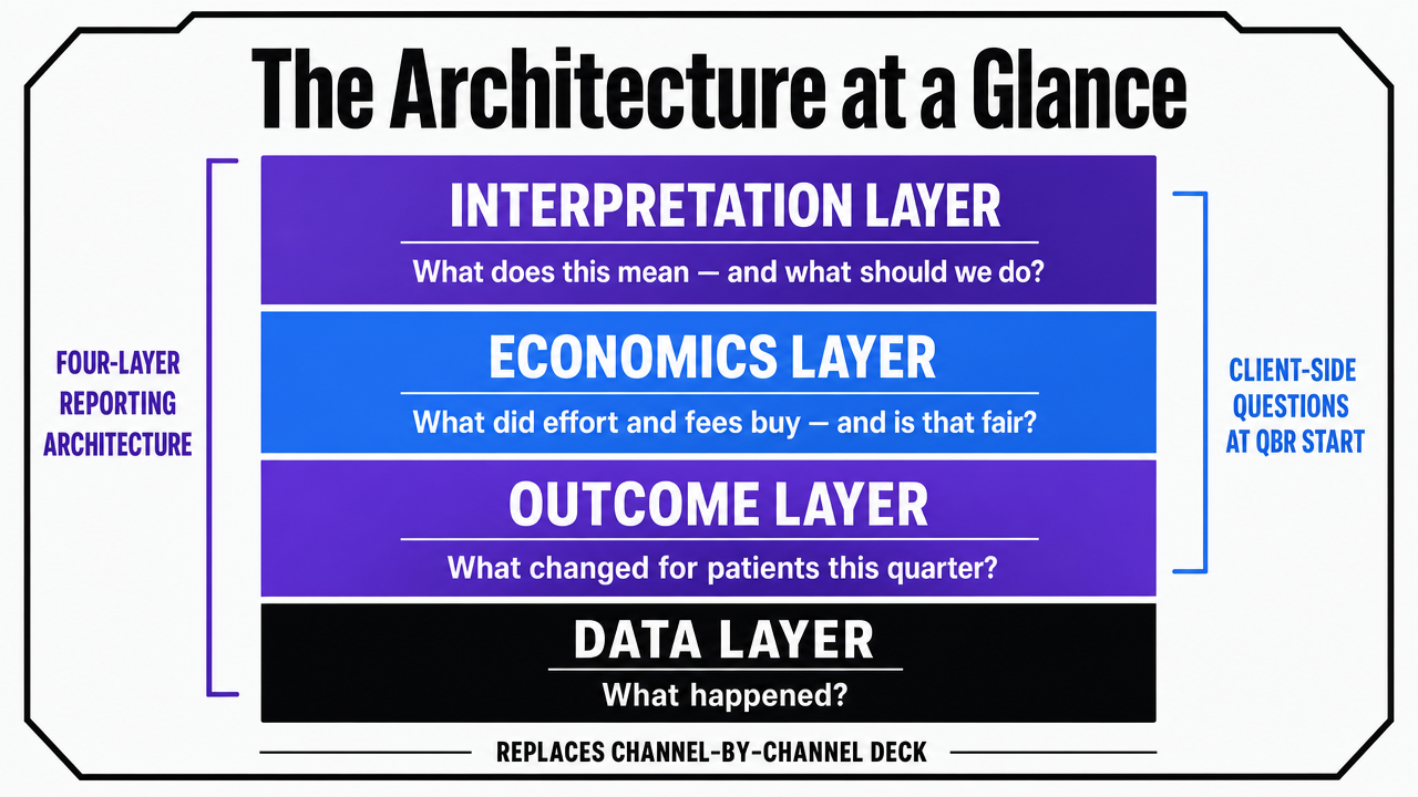
The Architecture at a Glance
Four layers replace the channel-by-channel deck. Each one answers a specific question the client-side marketing lead already has when the QBR begins.
Outcome Layer : Answers: what changed for our patients this quarter? It surfaces engagement-linked and journey-stage metrics rather than impressions, drawing on evidence that patient engagement correlates with care outcomes and provider productivity 1.
Economics Layer : Answers: what did effort and fees buy, and is that fair? It applies the disclosure logic behind healthcare price transparency to agency work, where upfront cost clarity has been shown to improve trust and collections 6.
Interpretation Layer : Answers: what does this mean, and what should we do? It treats reports the way effective patient portals treat clinical data, prioritizing clarity, responsiveness, and accessibility for non-specialists 2.
Expectation Layer : Answers: what did we agree to before this engagement began? It addresses the long-running expectation-satisfaction gap documented in ACSI data 8 by anchoring every report to the original promise.
The order matters. Outcomes go first because that is what the client opened the deck to find. Economics follows because that is the fairness test. Interpretation makes the first two readable. Expectation closes the loop. Channel detail still exists, but it moves to the appendix where a sophisticated reader can audit it without it crowding out the conversation.
 Visualize the four-layer reporting architecture described in this section, showing the stacked order and the question each layer answers
Outcome Layer: Patient-Experienced Value, Not Media Inputs
The Outcome Layer reports on what the client is internally accountable for: movement through the patient journey, by service line and by location. Inquiry volume, qualified inquiry rate, booked appointment rate, no-show rate, and returning-patient share belong on this page. Impressions and sessions do not.
The justification sits in the engagement literature. A review of patient engagement initiatives links engagement-linked metrics to improvements in care outcomes, satisfaction, and provider productivity, which means the metrics closest to patient action carry signal that media metrics cannot replicate 1. The same review notes that definitions of engagement vary across studies, which complicates cross-study comparisons 1. That caveat translates directly into a reporting discipline: define each engagement metric inside the report, including its data source and time window, rather than assuming the client maps the label the same way the agency does.
Healthcare marketing strategy research reinforces the framing. Effective marketing in healthcare requires in-depth investigation of patient needs and service design built around them, which means reports tied to channel activity miss the dimension the client measures internally 9. An outcome page that lists qualified inquiries by service line, against last quarter and against the original target, gives the client something they can take into their own executive review without re-cutting the data.
One operational rule keeps this layer honest. Each outcome metric appears with variance, not just a current value. A booked appointment count without a baseline reads as a number. The same count next to last quarter, the trailing four-quarter average, and the original engagement target reads as evidence. Variance is what tells the client whether the gap is closing.
Economics Layer: Fee, Effort, and Projected Value in the Open
The Economics Layer states what the engagement cost in fees and effort, what it produced in measurable value, and where the agency over- or under-spent against plan. Most agency reports avoid this page. The avoidance is the problem.
The Healthcare Financial Management Association's analysis of price transparency in patient billing found that proactive cost clarity, moving beyond minimum compliance toward upfront disclosure, improved both patient trust and collection rates 6. The mechanism is fairness. When patients can see costs in advance, surprise is removed and the provider reads as honest 6. The same mechanism applies inside agency reporting. A client services director who shows fees, hours allocated by service line, and projected versus realized value is not exposing weakness. They are removing the surprise that erodes the relationship between QBRs.
Federal price transparency rules offer a structural model. CMS requires both a machine-readable file of all hospital items and services and a consumer-friendly display of shoppable services, with the intent that patients know costs before receiving care 4. A narrative policy analysis of those rules describes price transparency as a tangible intervention designed to make prices understandable and comparable 3. Agencies can adapt that two-format logic. The detailed fee and hour breakdown lives in an appendix for the procurement-minded reader. A consumer-friendly summary, fees against outcomes by service line, sits on the Economics page itself.
One caveat from the same policy literature: transparency alone does not change behavior without guidance 3. A fee disclosure with no interpretation reads as a bill. A fee disclosure that names which service lines earned their allocation and which did not reads as accountability. That is the bridge into the next layer.
Interpretation Layer: Framing Data So Non-Specialists Can Act On It
The Interpretation Layer is where most agency reports lose the room. Numbers arrive without framing, and the client-side marketing lead is left to translate them for an internal audience that includes operations, finance, and clinical leadership. The translation work then falls on the buyer, which is the opposite of what the engagement is supposed to provide.
Research on online patient portals describes the underlying expectation precisely. Patients value clear, accessible information, responsiveness, and empowerment over raw data exposure, and clinicians worry that on-demand data without framing produces information overload or misinterpretation 2. The same tension appears in agency reports. A 40-tab export demonstrates effort. A short narrative that names what changed, why it changed, and what the agency recommends next demonstrates competence. The portal literature is explicit that the dominant ideas shaping the patient-provider relationship are patient-centered care and consumerism, both of which prioritize comprehension 2.
There is a risk on the other side. A peer-reviewed review of transparency in healthcare systems found that more data exposure without proper framing can erode trust when stakeholders misinterpret complex or unfavorable information 5. The Interpretation Layer exists to prevent that failure. Each metric on the Outcome and Economics pages carries a one-sentence read: what the agency believes the number means, what it does not yet support concluding, and what the agency will change next quarter as a result.
Healthcare analytics research adds the technical floor. A systematic review of data mining in healthcare emphasized that data quality, integration, and interpretability are the foundations of trustworthy analytics, and that complex models can undermine trust if their outputs are not made readable 7. Interpretation is not commentary added at the end. It is a quality control on whether the report should have shipped at all.
Expectation Layer: What Was Promised Before the Engagement Began
The Expectation Layer is the page most reports do not contain at all. It restates, in the same document, what the agency committed to deliver when the engagement started, what milestones were set for the current quarter, and how the reported outcomes compare against those commitments. Every report carries this page. The commitments do not move quietly between quarters.
The case for the layer is the gap itself. The California Management Review analysis of ACSI data from 1994 through 2022 found that the durable problem is not runaway expectations but misalignment and under-delivery, and the authors argue that overly optimistic reporting worsens the gap rather than closing it 8. A report that quietly reframes the target each quarter, dropping booked appointments when impressions look strong, or pivoting to engagement metrics when conversion stalled, widens the same gap the report is supposed to narrow.
The discipline is straightforward. The original engagement target appears verbatim on the Expectation page, along with any formally revised target and the date it was revised. The current quarter's result sits next to it. If the agency missed, the report says so, names the cause, and states the corrective action. If the agency exceeded, the report names what produced the lift so the client can decide whether it is repeatable.
This page also disciplines the previous three. Outcomes that do not map to a stated expectation get challenged. Economics that exceeded plan without a corresponding outcome lift get challenged. Interpretation that strays from the original promise gets challenged. The Expectation Layer is where the report's internal honesty is enforced.
See How Automated Reporting Builds Measurable Client Confidence
Request a walkthrough of data-driven reporting workflows that deliver transparent, real-time results—designed for agencies managing complex client portfolios and seeking to reduce manual oversight.
If You Manage Multiple Locations: Reporting Structure That Scales
Why Per-Location Reporting Collapses Across Service Lines
This section addresses client services directors running multi-location healthcare accounts specifically. The reporting problem inside those engagements is different from a single-site relationship, and the standard agency response makes it worse.
The default is to produce one report per location. An eight-location operator running three service lines generates twenty-four channel-by-channel views every cycle, and the account manager spends most of the reporting window assembling them. The deeper problem is that none of those reports answer the question the client-side leader actually has, which is how the service-line portfolio is performing across the footprint. A location-level deck cannot show that orthopedic inquiries grew in five markets while imaging stalled in three, because that pattern only appears when the data is cut by service line first and geography second.
Healthcare analytics research is direct about the prerequisite. A systematic review of data mining in healthcare names data integration and interpretability as the foundations of trustworthy analytics, and notes that fragmented data sources undermine the conclusions any report can support 7. Per-location reporting fragments the account by design. The report multiplies, the integration work falls to the client, and the outcome view never arrives.
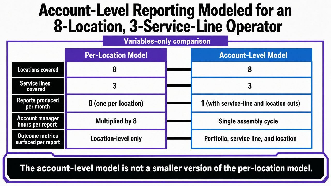
Account-Level Reporting Modeled for an 8-Location, 3-Service-Line Operator
The alternative is to report at the account level first, with location and service-line cuts as drill-downs rather than separate documents. The structural difference is easiest to see in a variables-only comparison for a hypothetical operator running eight locations and three service lines.
| Variable | Per-Location Model | Account-Level Model |
|---|---|---|
| Locations covered | 8 | 8 |
| Service lines covered | 3 | 3 |
| Reports produced per month | 8 (one per location) | 1 (with service-line and location cuts) |
| Account manager hours per report | Multiplied by 8 | Single assembly cycle |
| Outcome metrics surfaced per report | Location-level only | Portfolio, service line, and location |
Variables-only comparison of per-location vs. account-level reporting for a multi-location healthcare operator.
The account-level model is not a smaller version of the per-location model. It is a different unit of analysis. Reports are organized around the service-line portfolio across the footprint, with location cuts available where variance demands attention. That structure exposes the pattern the client-side leader is accountable for: which service lines earned their allocation across the network, which locations are dragging the line, and which combinations produced the lift.
The same healthcare analytics review that flags integration as a precondition for trustworthy reporting also emphasizes that interpretability is what makes integrated data useful to non-specialist readers 7. A consolidated account view supports interpretation because the comparisons live inside one document. A stack of eight location decks does not, regardless of how cleanly each one is built.
The operational consequence is that account-level reporting is the prerequisite for outcome-first narratives at multi-location scale. The Outcome, Economics, Interpretation, and Expectation layers described earlier can run on a single-site account by hand. Across an eight-location, three-service-line operator, they require a reporting unit that matches the way the client manages the business. Per-location output cannot be aggregated upward into that view after the fact; the unit of analysis has to be set before the data is assembled.
 Compare the per-location reporting model against the account-level model using the variables already cited in the article's table
See Benchmark-Driven Reporting That Builds Client Credibility
Access automated, audit-ready reporting workflows that surface real-time campaign impact, industry benchmarks, and attribution clarity—engineered for agency teams managing complex, multi-location accounts.
Operating the Loop Without Adding Account Managers
The four-layer architecture is straightforward to describe and expensive to run by hand. A client services director who tries to produce outcome-first, economics-clear, interpretation-rich, expectation-anchored reports across an eight-location operator on the current account management headcount will miss the cadence within two quarters. The structure does not fail. The operating model behind it does.
Two operational shifts make the loop sustainable. The first is moving production work off the account manager's desk. Pulling GA4, Search Console, and ad platform data into a consolidated account view, writing the variance reads, and drafting the recommended next actions are the tasks that compound across locations and service lines. They are also the tasks most suited to automated specialist workflows that run continuously between QBRs rather than in a reporting-week sprint. The account manager's remaining job is the part the client actually values: judgment, framing, and the conversation in the room.
The second shift is cadence. Healthcare analytics research is direct that data integration and interpretability are the conditions for trustworthy reporting, and that fragmented pipelines undermine the conclusions any report can support 7. A loop that integrates account data continuously, with the four layers refreshed between formal reviews, gives the client services director something to walk into the QBR with instead of something to assemble during it. Platforms built for that continuous execution, including Vectoron, are the operational answer to a reporting architecture the team would otherwise have to staff against.
Frequently Asked Questions
References
- 1.Impact of Patient Engagement on Healthcare Quality.
- 2.Patient-Centered Care and Healthcare Consumerism in Online Patient Portals.
- 3.Price Transparency in United States' Health Care: A Narrative Policy Analysis.
- 4.Hospital Price Transparency.
- 5.Unveiling the shadows: obstacles, consequences, and challenges of information transparency in healthcare systems.
- 6.How price transparency improves patient trust and collection rates.
- 7.A Systematic Review on Healthcare Analytics: Application and Theoretical Perspective of Data Mining in Healthcare.
- 8.Are Customer Expectations Skyrocketing – What Can Companies Do?.
- 9.The impact of marketing strategies in healthcare systems.