
Key Takeaways
- Content metrics earn dashboard space only when they predict cash flow; NPS predicted zero of five financial outcomes while customer satisfaction predicted all five 3.
- Organize measurement in four tiers—customer mindset, behavior, product-market, and financial—so leading indicators can be traced into the revenue numbers a CFO underwrites 2.
- In legal, dental, and behavioral health, form-fill dashboards structurally underreport content ROI; an offline call-and-appointment attribution layer with CRM write-back is what finance will accept 9.
- Report in-quarter attributed revenue alongside rolling twelve-month yield from prior content cohorts, then run a weekly editorial loop that reassigns production toward topics producing booked revenue 6.
Why most content dashboards fail the CFO test
A content dashboard earns its place in the budget meeting when it forecasts cash flow. Most do not. They count sessions, scroll depth, MQLs, and engagement rates—numbers that move independently of revenue and that a CFO has no way to reconcile against the P&L.
The academic record is direct on this point. Marketing metrics should be judged by their ability to predict financial performance, not by how easy they are to measure 1. That standard quietly eliminates most of what populates a typical content scorecard.
The integrative review of the marketing–finance interface organizes the credible candidates into four tiers—customer mindset, customer behavior, product-market, and financial outcomes—and argues that lagged effects and risk must be modeled rather than ignored 2. Few in-house dashboards do either. They report last week's traffic and treat content like a media buy with a same-quarter return.
McKinsey's analytics work sharpens the operational version of the same critique: organizations invest heavily in dashboards but capture little value because the metrics are disconnected from the decisions executives actually make 8. A VP of Marketing presenting pageviews to a CRO who thinks in booked revenue is having two different conversations.
The fix is not another KPI. It is a measurement architecture built around predictive validity, offline conversion capture, and a feedback loop fast enough to change what gets published next week. The rest of this article lays out that architecture and the evidence behind each layer.
The predictive-validity problem: which metrics actually forecast cash flow
The NPS contradiction and what it means for content dashboards
The most widely deployed customer metric on content dashboards is also the weakest predictor of money. A 2024 American Marketing Association review of empirical research tested common customer metrics against five financial outcomes—sales growth, gross margins, operating cash flow, margin expansion, and shareholder value—and found that Net Promoter Score predicted zero of the five. Customer satisfaction predicted all five. Repurchase intention predicted two 3.
That gap is not a rounding error. It is the difference between a metric a CFO can underwrite and a metric a CFO has to take on faith. The Rice Business synthesis of the same body of work is blunt about it: when the question is operating cash flow or shareholder return, customer satisfaction is the only customer metric with predictive ability 4.
For a content dashboard, the implication is specific. Downstream survey metrics belong on the scorecard only if they forecast the financial outcome the executive team is being measured on. A regional law firm tracking NPS on intake confirmation pages is collecting a number that, by the evidence, does not move with booked revenue. A dental group measuring patient-reported satisfaction after a content-driven first visit is collecting one that does.
The scope of the AMA finding matters. It draws on cross-industry studies of customer metrics in established firms, not from any single content marketing experiment. The point is not that NPS is useless for diagnostics. It is that NPS does not earn space on a dashboard whose purpose is to forecast cash flow.
Judging metrics by predictive power, not measurement convenience
The selection rule that follows from the evidence is uncomfortable for most existing dashboards. A metric earns its place by predicting a financial outcome, not by being easy to pull from an analytics tool 1. Pageviews, time on page, and scroll depth are convenient. None of them have a documented predictive relationship with cash flow.
Wharton's framing of the same problem adds a second test: a metric is only worth tracking if leadership knows what it costs to move it and what moving it is worth in dollars 5. A content team that cannot answer both questions for a given KPI is reporting a number, not managing a lever.
The research on content marketing effectiveness reaches the same conclusion from a different angle. Content performance should be judged by its effect on customer behavior and business performance, not by short-term interaction metrics 10. Engagement is a diagnostic input. It is not the output an executive should be asked to fund against.
The operational filter for any content KPI is three questions:
- Does peer-reviewed or finance-credible research link this metric to a financial outcome?
- Can the team estimate the cost of improving it by a defined increment?
- Can the team estimate the revenue or margin impact of that improvement?
Any KPI that fails all three is decoration.
A four-tier metric stack content leaders can defend
Mindset, behavior, product-market, and financial: the layered architecture
The integrative review of the marketing–finance interface offers content leaders something most vendor frameworks do not: a peer-reviewed taxonomy that organizes metrics by their distance from cash. It groups them into four tiers—customer mindset, customer behavior, product-market, and financial outcomes—and treats each tier as an input to the next 2.
Customer mindset metrics : Measure what readers know, feel, and intend. Aided awareness, brand consideration, perceived expertise, and purchase intent live here. For a behavioral health network publishing clinical explainers, this tier captures whether the content moved a family from "researching options" to "considering this provider." Mindset metrics are leading indicators. They are not revenue.
Customer behavior metrics : Record what readers actually did. Calls placed, intake forms submitted, appointments booked, consultations attended, and repeat visits sit at this layer. This is where most content-attributed revenue gets created in legal, dental, and home services—and where most dashboards lose the trail because the conversion happens off-site.
Product-market metrics : Track aggregate performance in the served market: share of qualified inquiries, penetration within a service area, and growth relative to local competitors. A multi-office dental group expanding into a new metro tracks this tier to see whether content is winning the addressable population, not just the individual lead.
Financial metrics : Close the chain—revenue, gross margin, operating cash flow, customer lifetime value, and firm value. These are the numbers a CFO underwrites.
The taxonomy's point is that mindset and behavior metrics earn their place on a content dashboard only when the team can trace, with credible statistical work, how they propagate into the financial tier 2. A four-tier stack is not a reporting nicety. It is the structure that lets a VP show finance which leading indicator is moving which lagging one.
Cost-to-improve versus monetary value: bridging dashboards to the P&L
A four-tier stack tells a VP which metrics belong on the dashboard. It does not tell finance what to fund. The bridge between the two is a pair of numbers every reported KPI should carry: what it costs to move the metric by a defined increment, and what that movement is worth in dollars 5.
The Wharton framing is deliberately P&L-shaped. A regional law firm that wants to lift consultation-booking rate on its practice-area pages by two points needs to know the production and optimization cost of that lift, and the marginal revenue from the additional booked matters. Without both sides of the ledger, the KPI is a number on a slide.
The same logic applies to behavior-tier metrics that content directly influences:
- Cost per qualified call.
- Cost per booked appointment.
- Revenue per content-attributed patient over a defined retention window.
Each one earns its place on the dashboard because the team can name the investment required to improve it and the cash-flow consequence of doing so.
The research on content marketing effectiveness reinforces the same discipline. Content performance is evaluated against customer behavior and business performance, not interaction volume 10. A KPI that cannot be expressed as a lever with a cost and a payoff does not survive a budget conversation. The dashboard that travels into the finance meeting reports fewer numbers than the operational one, and each one carries both halves of the equation.
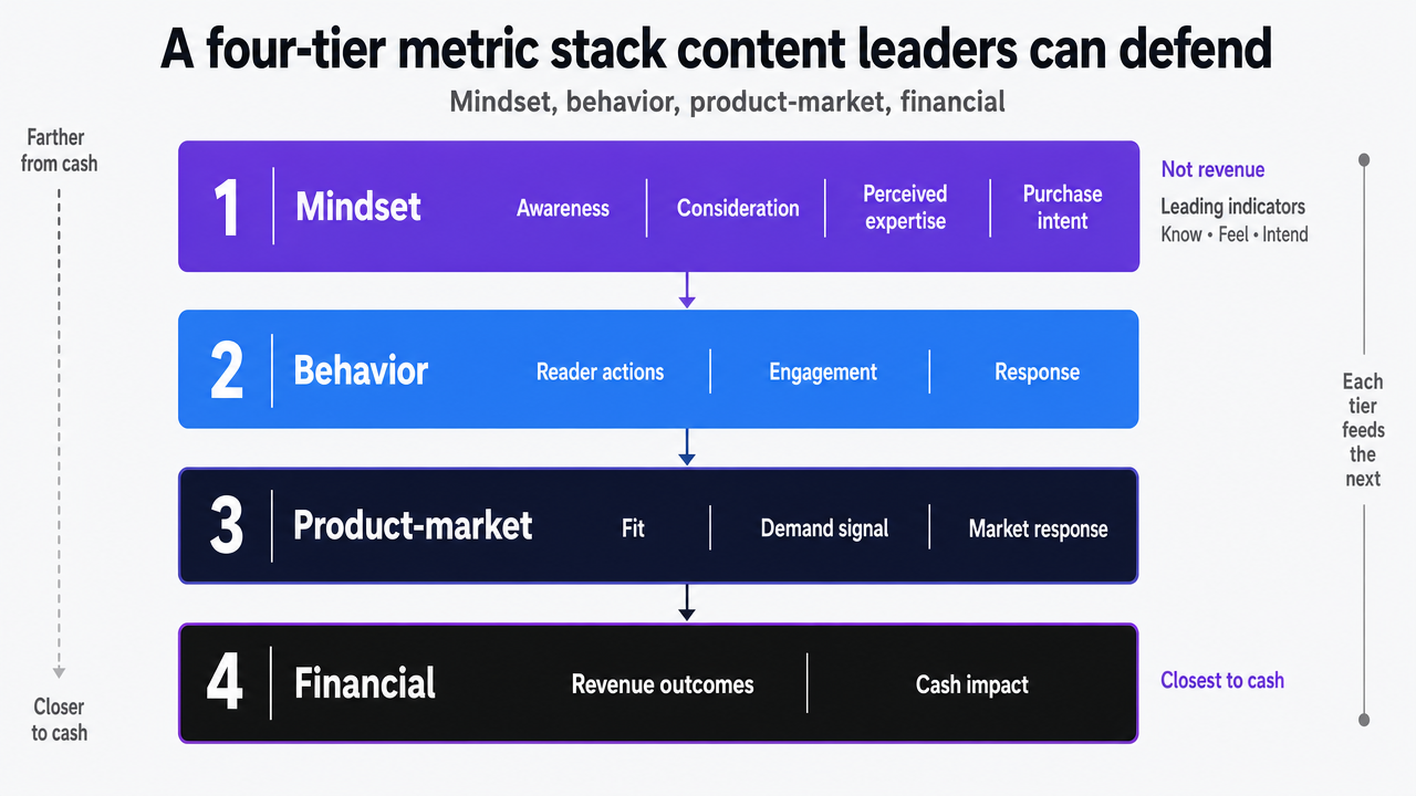 Visualize the peer-reviewed four-tier taxonomy (mindset, behavior, product-market, financial) that organizes the entire article's measurement architecture
Test Content Impact on Revenue Attribution Now
See how publishing real content connects your metrics directly to revenue within days.
The offline-conversion blind spot in high-stakes service verticals
Why form fills underreport content ROI in legal, dental, and behavioral health
In legal, dental, and behavioral health, the conversion that matters almost never happens on the page that ranked. A prospective client reads a practice-area article, scrolls to the bottom, and picks up the phone. A parent searching for adolescent IOP options reads three explainers and calls the intake line at 9 p.m. A new patient finds a clear-eyed piece on implant timelines and books by calling the front desk. The web form is the third-choice path, not the first.
Dashboards built around form submissions and on-site goal completions therefore underreport content's contribution by a structural margin, not a tuning error. The conversion event the analytics tool can see is a small share of the conversion events the content actually produced. McKinsey's healthcare consumer work names this directly: measurement has to link digital touchpoints to appointments, enrollments, and revenue rather than to siloed channel metrics, and the organizational barrier is the data gap between web analytics and the systems where bookings live 9.
The peer-reviewed content marketing effectiveness model arrives at the same conclusion from the research side. Content performance has to be judged by its effect on customer behavior and business outcomes, which in service verticals means calls placed, consultations attended, and treatment plans accepted 10. A dashboard that grades content on form-fill rate is grading it on the conversion path the audience uses least.
Building a call-and-appointment attribution layer that finance will accept
An attribution layer that survives a finance review has three jobs:
- Identify the content session that preceded the call or booking.
- Tag the inquiry by qualification and revenue potential.
- Write the result back to a record finance can audit against the P&L.
The first job is technical. Dynamic call tracking, session-stitched booking widgets, and CRM-linked intake forms cover the mechanics. The harder work is the second. A raw call count tells finance nothing—an intake line that fielded forty calls and converted four qualified matters reports the same volume as one that fielded forty wrong-number calls. The qualification layer is what turns call data into a behavior-tier metric the four-tier stack can use 2.
The third job is reconciliation. Content-attributed calls and bookings have to land in the same record set finance uses to count revenue. McKinsey's analytics research is explicit that the gap between dashboard outputs and executive decisions is where most analytics investment loses value 8. A content team that can show a CFO the call recording, the qualification tag, the booked appointment, and the eventual revenue—linked to the article the reader entered through—is having a different conversation than one presenting attributed sessions.
For high-stakes service operators, the practical output is a weekly report that names which content topics produced qualified calls, which produced unqualified ones, and what the booked-revenue yield was per topic. That is the artifact the budget meeting needs.
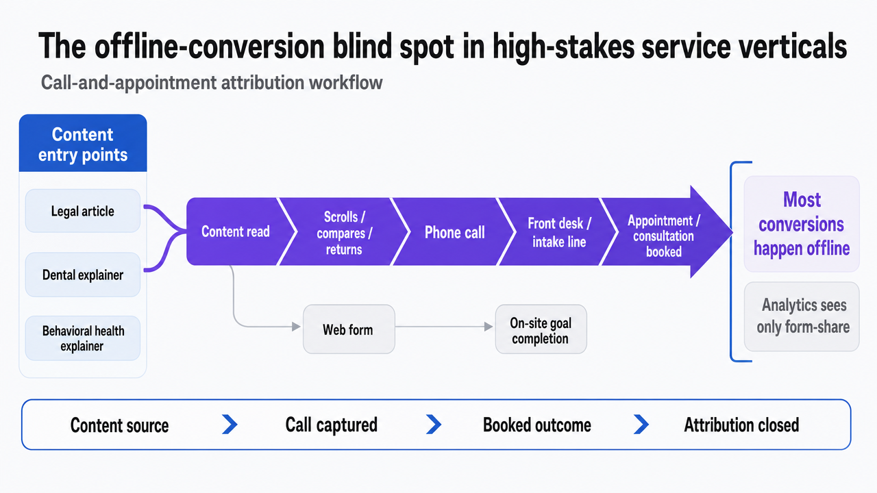 Show the call-and-appointment attribution workflow that closes the offline conversion gap in legal, dental, and behavioral health
Persistence and lag: defending content against quarterly defunding
Content's contribution to revenue does not arrive on a calendar quarter. A practice-area page indexed in March produces booked consultations in May, July, and the following January. A patient-education article published before an annual benefits cycle drives enrollment calls eight months later. Srinivasan and Hanssens' work on firm value is direct about the consequence: short event windows understate marketing's financial impact, and persistence models that capture how long effects last are the appropriate tool 6. A quarterly ROI review applied to a content investment is the wrong measurement instrument for the asset being evaluated.
That mismatch is where content budgets get cut. A CFO looking at ninety-day attributed revenue against ninety-day production cost sees a return that lags media buys with same-quarter conversion. The number is real. It is also incomplete, because it excludes the cash flows the same content will produce across the next four to eight quarters and the discount-rate effect of more predictable acquisition 6.
The defense is a measurement layer that reports both numbers side by side: in-quarter attributed revenue, and rolling twelve-month attributed revenue from content published in prior periods. The second number is what tells finance whether the library is compounding or decaying.
McKinsey's analytics research gives the organizational version of the same argument. The DataMatics work it cites finds that companies in the top quartile of analytics performance significantly outperform peers on customer acquisition and profitability, and the difference is not tool spend—it is whether analytics outputs connect to executive decisions 8. A VP who can show finance a persistence-aware revenue curve, tied to specific content cohorts, is operating in that top quartile. A VP reporting last quarter's sessions is not.
Operationalizing the loop: weekly signal flow, not quarterly reporting
Measurement that earns budget has to change what gets published next, not just what gets reported next quarter. The gap McKinsey names between analytics output and executive decisions is the same gap content teams face internally: signals arrive too late to redirect production 8.
A weekly loop has four moving parts:
- Qualified inquiries from the prior week, tagged by source topic and content cohort.
- Booked-appointment yield against those inquiries, pulled from the intake or CRM system rather than the analytics tool.
- Topic-level cost per qualified call, which tells the team where production dollars converted and where they did not.
- A short editorial review that reassigns the next sprint's briefs toward the topics producing booked revenue.
The cadence matters because content effects compound. Topics that produced ten qualified calls in week three often produce thirty in week eight, and the team that sees the slope early reinvests before the competitor does. The research on content effectiveness frames the same point at the model level: performance has to be evaluated against customer behavior and business outcomes, with measurement structured to feed back into the variables the team controls 10.
For a behavioral health network, the weekly artifact is a single page: topics published, qualified intakes attributed, booked admissions, cost per admission by topic, and the editorial decisions made as a result. That artifact is what turns a dashboard into a management system.
See How Leading Teams Tie Content Metrics Directly to Revenue Impact
Request a custom walkthrough of revenue-driven content reporting workflows used by top-performing agencies and enterprise brands—see where your pipeline visibility can improve without increasing headcount.
If you manage multiple locations: the unified measurement economics
Variables that determine per-location content economics
The framework so far assumes a single P&L. For multi-location operators—DSOs running thirty to two hundred practices, behavioral health networks with regional intake hubs, multi-office law firms, home services franchisors—the measurement problem changes shape. The unit of analysis is the location, and the question finance asks is which sites the content investment is actually funding.
The economics resolve to four variables the VP has to populate per location, not estimate at the group level:
- Locations in the measurement scope.
- Average qualified inquiries per location per month, tagged to content sources.
- Current cost per qualified inquiry, calculated as fully loaded content production and distribution cost divided by attributed qualified inquiries.
- Average revenue per booked appointment or matter over a defined retention window.
The arithmetic that matters runs across them. Qualified inquiries per location multiplied by booked-conversion rate yields booked appointments per location. Booked appointments multiplied by average revenue per booked appointment yields content-attributed revenue per location. Content-attributed revenue divided by fully loaded content cost yields the per-location return finance can audit. The peer-reviewed evidence is direct that content performance has to be expressed in customer behavior and business outcomes, not group-level interaction counts 10. Populating these four variables per site is what makes that possible.
Collapsing per-location reporting overhead with a single measurement layer
The operational tax of multi-location measurement is not the math. It is the reconciliation. A forty-office dental group typically runs forty intake systems, forty call-tracking configurations, and a marketing operations team rebuilding the same report each month in a spreadsheet finance does not trust. McKinsey's analytics work names the cost directly: the gap between dashboard output and executive decision is where most of the analytics investment leaks, and the leak widens with every system that has to be hand-stitched 8.
A single measurement layer—one call-tracking schema, one qualification taxonomy, one attribution model, one CRM write-back path—collapses that overhead into a query rather than a project. The integrative review of marketing-finance metrics underwrites the point structurally: customer behavior metrics only ladder to the financial tier when they are captured consistently enough to model across units 2. Forty inconsistent intake taxonomies cannot be aggregated; they can only be reported.
The artifact a VP should be able to produce on demand is one table: per-location qualified inquiries, booked appointments, attributed revenue, cost per booked appointment, and rolling twelve-month yield from prior-period content. That table is what turns multi-location content from a budget line into a managed portfolio.
What to ship in the next 90 days
The measurement architecture in this article is not a quarterly initiative. It is a sequence a VP can stage across three sprints, each producing an artifact finance can audit.
- Days 1–30. Strip the existing content dashboard to the metrics that pass the predictive-validity filter: customer behavior indicators tied to qualified calls, booked appointments, and attributed revenue 2. Retire NPS as a downstream KPI and replace it with customer satisfaction measured post-conversion 3. Name the cost-to-improve and dollar-value figures for every metric that survives 5.
- Days 31–60. Stand up the offline conversion layer. One call-tracking schema, one qualification taxonomy, one CRM write-back path. The goal is a weekly report that names which topics produced qualified calls, which produced booked appointments, and what the revenue yield was per topic 9.
- Days 61–90. Add the persistence view. Report in-quarter attributed revenue alongside rolling twelve-month yield from prior content cohorts 6. Establish the weekly editorial review that reassigns production toward topics producing booked revenue 8.
The output at day 90 is a one-page artifact: topics, qualified inquiries, booked revenue, cost per booked appointment, and the editorial decisions made against the data. That page is what the budget meeting needs—and what content teams running on the Vectoron platform produce as the default reporting cadence.
Frequently Asked Questions
References
- 1.Metrics for Linking Marketing to Financial Performance.
- 2.The marketing–finance interface: A new integrative review of metrics, methods, findings, and future directions.
- 3.Which Customer Metric Best Predicts Financial Performance?.
- 4.Back To Basics: Which customer metrics indicate financial growth—and which are just noise?.
- 5.Connecting Marketing Metrics to Financial Consequences.
- 6.Marketing and Firm Value: Metrics, Methods, Findings, and Future Directions (JMR version).
- 7.The Impact of Marketing Strategies in Healthcare Systems.
- 8.The Secret to Great Marketing Analytics? Connecting with Decision Makers.
- 9.Marketing in healthcare: Improving the consumer experience.
- 10.Determinants of content marketing effectiveness: Conceptual framework and empirical findings.