
Key Takeaways
- Lead the dashboard with revenue, qualified conversions, and period-over-period delta so finance teams see organic search in P&L language rather than rankings or impressions 2, 10.
- Structure KPIs across four tiers—business outcomes, traffic, rankings, and AI visibility—with an attribution toggle that shows last-click alongside data-driven credit for the same conversions 5.
- Build the ROI panel on Forrester's TEI categories: direct revenue, conversion lift, and displaced paid spend against technology, agency fees, and internal time—transparently, including your own fees 10, 4.
- Move portfolios toward a warehoused architecture that centralizes GSC, GA4, CRM, and rank data, cutting strategist reconciliation from 6–10 hours per client monthly to 1–2 1.
Why Client Dashboards Fail the CFO Test
Most SEO dashboards are built for the marketing manager who approved the retainer, not for the finance executive who will eventually decide whether to renew it. That mismatch is where agencies lose accounts. A dashboard packed with keyword positions, impression trends, and Core Web Vitals scores answers questions a CFO never asked. The questions that matter—how much revenue organic search produced, what it displaced in paid spend, and what it cost to generate—usually sit somewhere off-screen in a spreadsheet the strategist opens the night before a QBR.
Practitioner guidance has been direct about the reframe for years. An executive summary should open with "organic search generated $X in revenue this quarter through Y new customers," not with a chart of average position 2. Yet the default Looker Studio templates most agencies ship still lead with visibility metrics because those metrics are the easiest to pipe in from Google Search Console.
The deeper problem is structural. Forrester's own analyst work notes that many organizations under-invest in SEO precisely because they cannot quantify its impact against other channels 4. When the dashboard cannot answer the finance question, the finance team assumes the answer is unfavorable. Retention conversations then hinge on the paid team's ROAS report, which does have dollars attached, and organic gets cut or flattened. The rest of this piece rebuilds the dashboard around that scrutiny.
The Four-Tier Information Architecture
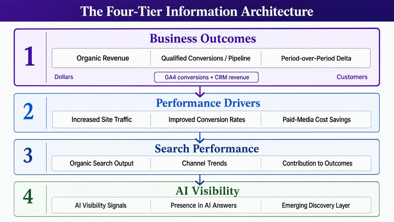
Business Outcomes as the Top Tile
The tile above the fold answers one question: what did organic search produce this period, in dollars and customers. Practitioner guidance for SEO client reports models the opening line directly—"Organic search generated $X in revenue this quarter through Y new customers" 2. That single sentence, rendered as a live tile pulling from GA4 conversion data joined to CRM revenue, does more retention work than any ranking chart underneath it.
The tile should carry three numbers and nothing else: revenue attributed to organic, qualified conversions or pipeline value, and the period-over-period delta. Forrester's Total Economic Impact framework for SEO explicitly treats increased site traffic, improved conversion rates, and paid-media cost savings as the benefit categories that justify program spend 10. The executive tile is where those benefits get expressed in the client's own P&L language.
What does not belong on the top tile: average position, impressions, click-through rate, or Core Web Vitals. Those are diagnostic instruments for the strategist, not decision inputs for the buyer's finance team. McKinsey's marketing ROI work frames the same discipline across channels—spend gets prioritized against measurable outcomes, not against activity metrics 9. An SEO dashboard that opens with activity concedes the channel comparison before the QBR begins.
Traffic, Rankings, and AI Visibility Below the Fold
Below the executive tile sits the operator layer. A 2026 client reporting guide organizes SEO KPIs into four tiers—business outcomes, traffic metrics, rankings, and AI visibility—and that hierarchy is the cleanest information architecture available for a client-facing dashboard 5. Business outcomes stay at the top. Traffic, rankings, and AI visibility fill the second, third, and fourth tiers in descending order of finance-team relevance.
Traffic metrics carry clicks, sessions, and engaged sessions segmented by branded versus non-branded queries. Enterprise dashboard guidance recommends a composite traffic performance view combining aggregate clicks, impressions, CTR, and average position with click and impression trends over time and top keywords and pages 1. That view is the strategist's daily working surface and the client's evidence that momentum exists.
Rankings sit lower because position is a leading indicator, not an outcome. The baseline KPI set—organic traffic, keyword rankings, CTR, conversion rate, bounce rate, page speed, backlinks—still belongs on the dashboard, but as a diagnostic panel rather than a headline 3. Position tracking earns its space when it is paired with commercial intent tagging so the strategist can see whether the pages moving are the pages that convert.
The fourth tier is where most agency dashboards fall behind. AI citation rate and referral traffic from ChatGPT, Perplexity, and Gemini are now first-class metrics in modern reporting frameworks, and their absence is increasingly noticed by clients whose paid teams are already reporting AI-surface impressions 5. A tier that starts empty is fine. A tier that never appears is a credibility gap.
The Attribution Hinge: Crediting Organic Fairly
Every renewal conversation eventually reaches the same question: how much of what closed actually came from organic search. The answer depends almost entirely on which attribution model the client's analytics stack is running, and most clients do not know which one is running until an agency lead shows them.
A 2026 client reporting guide notes that in implementations using data-driven attribution, organic search's attributed conversion value increases 30–60% compared to last-click attribution models 5. The range comes from Google's own comparison of GA4 conversion paths across accounts that switched models, and it varies with the length of the buying cycle and the number of touchpoints before conversion. Short cycles with few touchpoints see the smaller uplift. Longer B2B and considered-purchase cycles, where organic tends to open the session and paid or direct closes it, sit at the higher end. This is not a promise of a 30–60% revenue increase—it is a shift in how existing conversions get credited.
That distinction is what a dashboard has to carry. The attribution comparison belongs on the client dashboard as a toggle or a side-by-side view, not buried in a GA4 exploration the client will never open. Two conversion totals for the same period, one under last-click and one under data-driven, with the delta rendered as a percentage. The strategist can then walk the QBR through the actual assisted paths—organic session on a comparison page, direct return visit two weeks later, paid brand click at close—and show which channel initiated the sequence.
Practitioner reporting guidance has been pushing this reframe for years, acknowledging the difficulty of explaining multi-touch models to clients who have been trained on last-click ROAS by their paid teams 2. The dashboard is the explanation. When the finance team sees the same conversions credited two ways, the conversation stops being organic-versus-paid and starts being about which sequences produce customers. That is the conversation an agency lead wants to have going into a renewal.
One operational note: data-driven attribution requires a minimum conversion volume in GA4 before Google will model it, so smaller accounts default back to last-click whether the client realizes it or not. The dashboard should flag which model is active per property. A tile that says "attribution model: data-driven" or "attribution model: last-click (insufficient volume)" prevents the awkward QBR where the strategist claims uplift the client's own analytics is not calculating.
Test a live SEO dashboard for client ROI
Directly measure how automated recommendations impact client KPIs using real campaign data during your trial.
ROI Math That Survives Scrutiny
Applying the TEI Model to an SEO Program
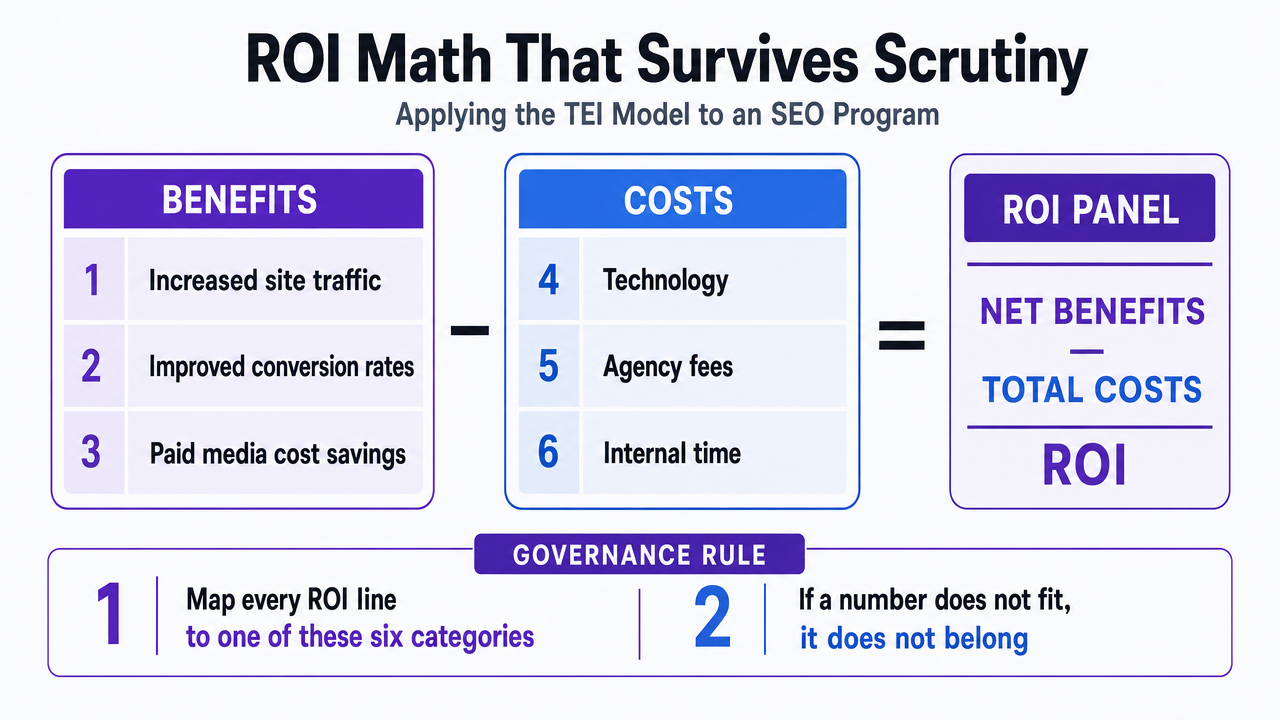
The dashboard's ROI panel needs a defensible structure, not a made-up multiple. Forrester's Total Economic Impact methodology gives agency leads the cleanest scaffold available. The model quantifies benefits of an SEO program as increased site traffic, improved conversion rates, and cost savings from paid media, then nets those against costs including technology, agency fees, and internal time 10. Every line on the ROI panel should map to one of those six categories. If a number does not fit, it does not belong on the tile.
The benefit side is where most dashboards stop halfway. Direct revenue from organic conversions is the easy line—GA4 conversion value joined to CRM closed-won data, filtered to organic sessions under whichever attribution model the property is running. Conversion-rate lift is harder because it requires a baseline: the strategist has to fix a reference period, usually the trailing twelve months before the current engagement started, and calculate the delta on organic sessions specifically rather than site-wide. Paid-media savings is the line most agencies never add. When organic captures branded queries and high-intent non-branded terms, the paid team spends less on those same terms. The dashboard should surface that displaced spend as a benefit line, calculated from the paid account's own historical CPC on the queries organic now owns.
The cost side is equally explicit in the TEI model. Forrester treats technology spend, agency fees, and internal client time as the three cost categories that reduce SEO's net impact 10. Agency leads sometimes flinch at surfacing their own fees on the client's dashboard. That reluctance is what makes the panel indefensible when the CFO asks. A dashboard that shows fees against benefits, transparently, is the one that survives the renewal review 4.
Sizing Paid-Media Savings and Content ROI
Paid-media savings is the line item that ends the organic-versus-paid argument. The calculation is mechanical: pull the queries where organic now ranks in positions one through three, look up what the paid account paid per click on those same queries in the reference period, multiply by current organic clicks, and render the result as displaced spend. Practitioner reporting guidance treats this as core to framing organic as a revenue channel rather than a cost center 2.
The dashboard should segment this by query intent. Branded terms produce the largest displaced-spend numbers but the weakest strategic argument—the client would likely rank for their own brand regardless. Non-branded commercial queries carry the credible savings line. A page cluster targeting comparison and buying-intent terms, ranking in the top three, is directly offsetting paid budget the client would otherwise be spending.
Content ROI belongs on the same panel, sized per page or per cluster rather than in aggregate. Each published asset gets attributed sessions, attributed conversions, and attributed revenue over a trailing window. The strategist can then rank content by dollar contribution and retire or rewrite the bottom quartile. That view converts the content backlog from a cost center into a portfolio the client can reason about the same way they reason about paid campaigns 9.
The Data Engineering Beneath the Pretty Charts
GSC Row Caps and the Count-vs.-Detail Trade-off
Every dashboard that pulls from Search Console inherits a set of measurement constraints most agencies never surface to clients. The Search Console user interface caps exports at 1,000 rows of data, and the Search Analytics API caps at 50,000 rows per day per site per search type 6. For a mid-sized ecommerce client generating tens of thousands of unique queries per month, those caps mean the dashboard is showing a sample, not a census. The strategist who does not know this is telling the client a story built on truncated data.
The subtler problem is the count-vs.-detail trade-off. Google's own API documentation is explicit: for accurate counts, the query has to omit the page and query dimensions; for greater detail including page or query information, the request loses some data 7. This is why the totals in a property-level tile rarely reconcile with the sum of the top-pages tile beneath it. They are literally different queries against different aggregations. A dashboard that displays both without a reconciliation note invites the exact QBR question no strategist wants: "why don't these numbers add up?"
The engineering fix is boring and non-negotiable. Property-level counts run as one API call without page or query dimensions. Detail views run as separate calls with dimensions attached, paginated across the 50,000-row daily ceiling, and flagged in the dashboard footer as "sampled detail view" 6, 7. Large accounts require daily incremental pulls into a warehouse rather than live connections, because live connectors re-hit the cap every time a client opens the tab. The pretty chart on top is fine. What sits underneath it is a scheduled job, a row-limit budget, and a documented reconciliation rule.
Reconciling GA4, CRM, and Rank Data Without Double-Counting
Three systems, three definitions of a conversion. GA4 counts an event fired by a tag. The CRM counts a record created by a form handler or a sales rep. The rank tracker counts nothing but position. When the dashboard joins them, the strategist has to decide which system holds the source of truth for each metric—and stick to it.
The working rule most agencies converge on: GA4 owns sessions and channel attribution, CRM owns revenue and closed-won status, and rank data joins at the query-to-landing-page level. Revenue never comes from GA4's ecommerce module when a CRM exists, because deal amendments, refunds, and offline close events never round-trip back into analytics. Practitioner guidance on client reporting has been consistent that CRM data is what makes the revenue tile defensible 2.
Double-counting happens at the join. A single organic session that produces a form fill, a follow-up call logged in the CRM, and a second GA4 event two weeks later can be credited three times if the dashboard does not deduplicate on a stable identifier—usually the CRM contact ID passed back into GA4 as a user property. The reconciliation query runs on that ID, not on the session. Enterprise dashboard architecture pulls GSC, analytics, business profile, and rank data into a single warehouse for exactly this reason 1. The join lives in one place, gets audited once, and every tile downstream inherits the same definition.
What the Strategist Actually Does With It
A dashboard is a working surface, not a wall decoration. The strategist opens it Monday morning and runs a short loop: check the executive tile against last week, scan the traffic tier for anomalies, then drop into the GSC performance view to diagnose. Practitioner workflows for the Search Console Performance report are built around exactly this diagnostic pattern—spotting trend breaks, isolating queries or pages that shifted, and identifying cannibalization where two URLs are splitting impressions on the same query 8.
Cannibalization is the recurring find. Two pages ranking positions eight and eleven for the same commercial query, neither converting, when a consolidated page would likely rank four and convert. The dashboard surfaces the pair. The strategist decides whether to redirect, merge, or re-optimize, and logs the decision. That decision becomes an approved change, not a background edit the client learns about in a QBR three months later.
The second recurring move is content triage. The content ROI panel ranks pages by attributed revenue over a trailing window 2. Bottom-quartile pages get flagged for rewrite, consolidation, or retirement. Top-quartile pages get expansion—internal links from adjacent clusters, refreshed data, additional intent variants. The dashboard is not telling the strategist what to do. It is compressing the weekly triage from four hours of tab-switching to a single ranked list with the approvals attached.
See How a Unified SEO Dashboard Demonstrates Measurable ROI Across All Clients
Request a walkthrough of a centralized, approval-driven SEO dashboard designed for agencies. Visualize channel performance, client ROI, and workflow status—all in one place, with data transparency built for enterprise reporting needs.
If You Manage a Portfolio: Scaling Reporting Without Scaling Analysts
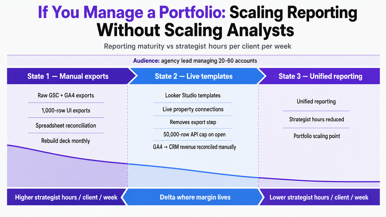
A note on audience: the sections above assume a single client dashboard. This one shifts to the agency lead running a book of 20 to 60 accounts, where the constraint stops being dashboard design and starts being strategist hours per account per week.
The economics break down at three reporting maturity states, and the delta between them is where margin lives.
- State one is manual reporting from raw GSC and GA4 exports—strategists pulling 1,000-row UI exports, reconciling them against analytics in a spreadsheet, and rebuilding the deck each month 6.
- State two is templated Looker Studio dashboards connected live to each property, which removes the export step but re-hits the 50,000-row API cap every time a client opens the tab and still leaves the strategist to reconcile GA4-to-CRM revenue manually 7.
- State three centralizes GSC, analytics, business profile, and rank data into a warehouse with automated ROI calculations layered on top, following the enterprise dashboard pattern 1.
The labor math, expressed in variables rather than invented dollars:
| Reporting state | Strategist hours per client per month | Cost at blended rate $X/hr |
|---|---|---|
| 1. Manual GSC/GA4 exports | 6–10 | $6X–$10X |
| 2. Templated Looker Studio | 3–5 | $3X–$5X |
| 3. Warehoused, automated ROI | 1–2 | $1X–$2X |
Across a 40-client portfolio, the difference between state one and state three is roughly 200 to 300 strategist hours per month redirected from reconciliation into actual optimization work. Forrester's TEI framework treats internal time as an explicit cost line against SEO's net impact, which is the same line that shows up on the agency's own P&L as strategist capacity 4.
Standardize what the CFO sees: the executive tile, the attribution toggle, the TEI-structured ROI panel. Customize what the strategist works from: the query-level diagnostic views, the content ROI ranking, the cannibalization pairs. The goal is a portfolio where every dashboard opens with the same three numbers on top and every strategist review runs under an hour per account per week.
Governance: Approvals, Change Logs, and Defensibility
The dashboard is also a record. Every ranking change, content rewrite, redirect, and technical fix that the strategist ships needs a timestamp, an owner, and a client-side approval attached to it. Without that layer, the QBR becomes an argument about causation—did the traffic move because of the work, or in spite of it—that the agency cannot win.
The governance panel sits alongside the ROI panel and carries three columns: what was proposed, when it was approved, and what metric it moved in the trailing window. A cannibalization merge approved on the fifteenth shows up next to the query-level click delta measured four weeks later 8. A content rewrite approved in Q1 appears against its attributed revenue by Q3 2. Forrester's TEI framework treats internal time and agency fees as explicit costs against SEO's net impact, which means every approved change is both a benefit driver and a cost line the dashboard has to reconcile 4. Approval-first governance is what makes the ROI panel defensible when finance asks which specific decisions produced the number.
Frequently Asked Questions
References
- 1.Enterprise SEO Reporting: Tips For Developing Effective Dashboards.
- 2.How To Write SEO Reports That Get Attention From Your Clients.
- 3.Mastering SEO Client Reporting [2024 Guide].
- 4.The ROI Of SEO.
- 5.Client SEO Report Guide: Templates, KPIs, and AI Metrics (2026).
- 6.A deep dive into Search Console performance data filtering.
- 7.Getting your performance data | Search Console API.
- 8.GSC Performance Report – 5 Actionable Insights.
- 9.Marketing Return on Investment | Growth, Marketing & Sales.
- 10.You Can Quantify The ROI Of SEO.