
Key Takeaways
- Treat an SEO content score as a diagnostic composite, not an outcome—it earns its place only when it predicts qualified sessions, conversions, and pipeline contribution 5, 10.
- Tool-generated grades break down through vanity ceilings, journey blind spots, and commercial-intent gaps, so layer direct conversions, influenced conversions, and journey coverage on top of the composite 7, 9.
- Score bands should trigger economic decisions: retire 0–40 pages, refresh the 41–70 leverage zone, scale 71–85 assets horizontally, and defend 86–100 pages through syndication and cadence 1.
- Multi-location operators should score at the cluster level, allocate refresh dollars to siblings leaking share of voice, and gate AI-assisted velocity behind an outcome-layer approval step 2, 9.
The Quality Score Analogy: Why Composite Content Grades Only Matter When They Predict Revenue
Google's Ads team calls Quality Score a "diagnostic tool" rather than a performance metric, because the number itself doesn't win auctions. It reflects the relevance and usefulness of ads and landing pages and points advertisers toward the optimizations that actually move outcomes 5. That framing is the right starting point for anyone trying to make sense of an SEO content score. The grade a tool puts on a draft is diagnostic. It is not the outcome.
Content managers running against velocity and revenue targets tend to inherit scoring systems in one of two forms. The first is a spreadsheet scorecard, often modeled on the AMA's 1–5 rating framework, where writers and editors grade assets against target KPIs and roll the ratings into a summary view 1. The second is a tool-generated grade, produced by an optimization platform that compares a draft against top-ranking competitors. Both are useful. Neither is self-justifying.
The question a content P&L owner should ask is narrower than "is the score high?" It is whether the composite predicts the outcomes the business is paying for: qualified organic sessions, influenced conversions, pipeline contribution, and retention signals. Industry guidance is increasingly explicit on this point. Content measurement should connect to business outcomes like revenue, pipeline, or customer retention, not stop at engagement rates 10. And the metrics feeding a score should reflect meaningful outcomes—conversions and revenue—rather than vanity signals like raw traffic 9.
The rest of this piece treats an SEO content score the way an ads team treats Quality Score. It is a composite diagnostic. It earns its place in the workflow only when it forecasts revenue-weighted results and tells editors where the next hour of effort should go.
What a Content Score Actually Measures (And What It Ignores)
The Four Dimensions Underneath a Composite Grade
Peel back any content scoring system and the same four dimensions tend to surface:
- Relevance measures how closely the draft matches the query and topical entities a searcher expects.
- Engagement predicts whether readers will stay, scroll, and interact.
- Technical quality captures the structural signals that make a page indexable and readable, from heading hierarchy to internal linking to Core Web Vitals.
- Conversion contribution weights the page's role in driving a defined business action, whether that is a demo request, an appointment booking, or a newsletter opt-in.
The mental model here maps directly onto Google's composite for paid search. Quality Score blends expected click-through rate, ad relevance, and landing page experience into a single diagnostic that guides where advertisers should invest optimization effort 5. An SEO content score does the same job for organic assets: it rolls disparate inputs into one comparable number so editors can rank drafts against a target, not just against each other.
What weight each dimension carries is not neutral. A tool tuned for informational blog posts will over-index on relevance and depth. A commercial landing page score should weight conversion contribution far higher, because the asset's job is to move qualified traffic into pipeline. Practical scorecards like the AMA's 1–5 framework let teams set those weights explicitly against KPIs and roll individual ratings into a summary view 1. The composite is only as honest as the weights behind it.
Engagement and Intent Signals from GA4 and Search Console
The engagement dimension of a content score has to be fed by real behavioral data, not tool-simulated predictions. GA4 and Search Console together provide the operational inputs. Organic sessions, impressions, clicks, click-through rate, and average position tell editors whether the asset is winning the auction for attention. Engagement rate, average engagement time, and scroll depth reveal whether the visitor stays long enough for the content to do its job 2.
High engagement on an informational page indicates the content is satisfying intent. Low engagement, especially paired with strong impressions and a weak click-through rate, usually points to a mismatch between what the title promises and what the page delivers 2. That diagnostic is more useful than a static grade because it isolates the failure point: either the SERP snippet is wrong, or the on-page delivery is.
For commercial pages, the intent signal shifts. Bounce rate, conversion rate, and page views become the primary inputs, and the score's engagement dimension should down-weight time-on-page relative to conversion completion 6. A five-minute read that produces no demo requests is a worse commercial asset than a ninety-second page that converts.
Search Console impressions by pillar and topic-level ranking distribution also expose whether a cluster is functioning as an asset or as isolated pages 2. A score that ignores cluster-level performance rewards individually optimized posts that leak share of voice across the topic. The engagement layer is where a score either connects to real user behavior or drifts into simulation.
Where Tool-Grade Scoring Breaks Down
A tool-generated grade tells editors how closely a draft resembles pages currently ranking. It does not tell them whether those pages convert, whether the query has commercial intent worth pursuing, or whether the topic sits inside a journey stage the business actually needs to cover. Three failure modes recur.
The first is the vanity ceiling. Optimizing to a 90+ grade on every draft can inflate word count, keyword coverage, and heading density without moving conversions. Content measurement guidance is explicit that scoring should prioritize outcome metrics like conversions and revenue over raw traffic and depth signals 9. A high grade attached to a page that produces no pipeline is a diagnostic failure.
The second is the journey blind spot. Tool scores rarely assess whether an asset fills a gap in the buyer journey or duplicates coverage the site already has. Advanced measurement frameworks add topical journey coverage and content-gap analysis precisely because page-level grades miss cross-touchpoint effects and influenced conversions 7.
The third is the commercial-intent gap. A score built on top-ranking competitor pages inherits the intent of whoever currently ranks. If the top ten are informational and the business needs a commercial asset, the grade will actively pull the draft in the wrong direction. Keyword difficulty, search volume, and cost per click give a fuller read on whether the target query is worth the editorial spend in the first place 8.
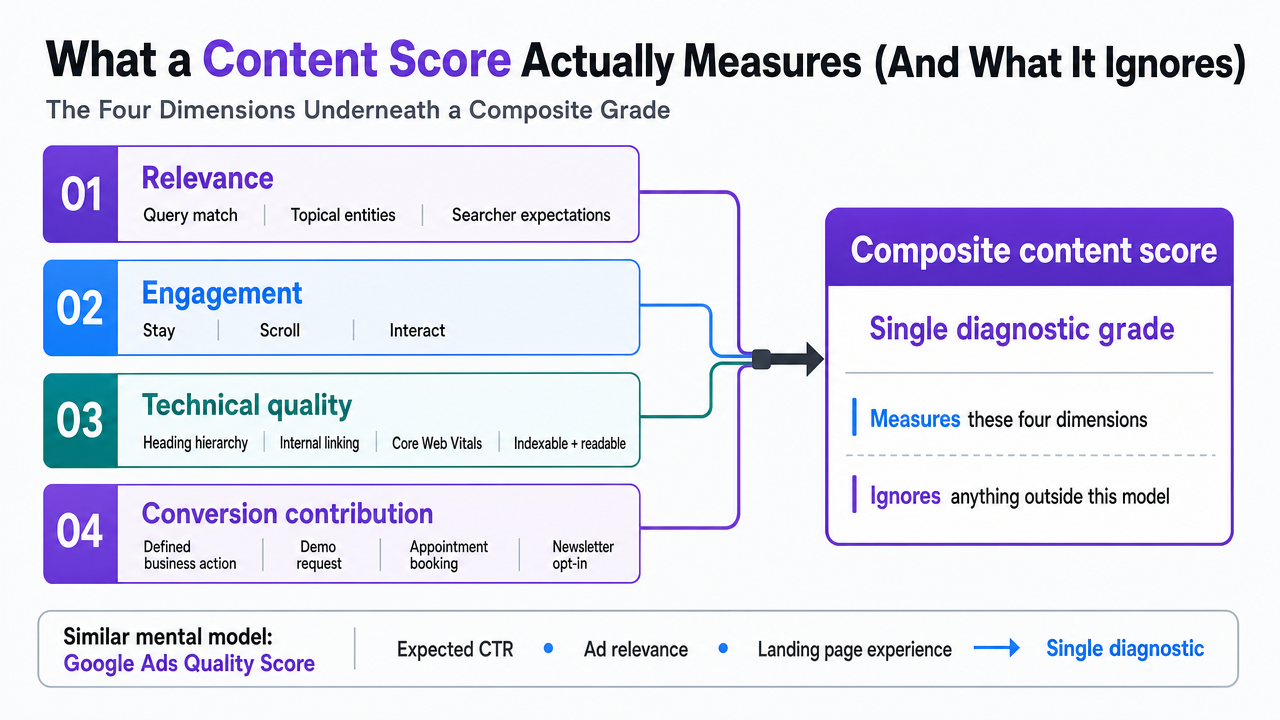 Visualize the four composite dimensions of an SEO content score described in the section, showing how they roll into a single diagnostic grade
Reframing the Score as a Revenue-Weighted Portfolio Signal
Vanity Grades vs. Outcome Grades
A 92-grade draft that produces zero demo requests is a vanity grade. A 74-grade draft that generates fifteen qualified leads a month is an outcome grade. The distinction matters because most scoring systems, left unmodified, reward the first and ignore the second.
The vanity-versus-outcome split is the sharpest lens content managers can apply to their scorecards. Effective measurement prioritizes signals that reflect meaningful business impact—conversions and revenue—over raw traffic and depth metrics that inflate dashboards without moving pipeline 9. When a scoring rubric treats word count, keyword density, and heading structure as first-class inputs but leaves conversion contribution as a footnote, it produces graded content that looks strong in editorial review and underperforms in the P&L.
Rebuilding the score as an outcome grade means adding a business-impact layer on top of the tool-generated composite. Bounce rate, conversion rate, and page-level revenue attribution belong inside the score itself, not in a separate report the team reviews quarterly 6. The mechanics from the AMA scorecard model make this practical: assign 1–5 ratings against KPI targets for both quality dimensions and outcome dimensions, then roll them into a single weighted view so editors can see which drafts earn their production cost 1.
The result is a score that a VP or CMO can actually use. It stops answering "is this well-optimized?" and starts answering "is this earning its slot in the portfolio?"
Layering Influenced Conversions and Journey Coverage
Direct conversions are the easy half of the outcome layer. A visitor lands on a comparison page, fills out a form, and the attribution model credits the page. Most GA4 setups handle that cleanly. The harder half—and the more valuable one for content managers defending editorial budgets—is influenced conversions.
Influenced conversions capture the assisted role content plays across a multi-touch journey. Advanced measurement frameworks treat direct and influenced conversion rates as distinct KPIs precisely because informational and mid-funnel assets rarely close deals on their own, but they compound the probability that a later touchpoint does 7. A score that ignores this dimension will systematically undervalue top-of-funnel content and push editorial investment toward bottom-funnel pages the sales team could probably close without content help.
Journey coverage is the companion input. The relevant question is not "how does this page score?" but "does the portfolio have enough scored assets at each journey stage, and where are the gaps?" 7. A revenue-weighted score should flag when a topical cluster is over-indexed on awareness content and under-indexed on evaluation-stage assets, or when a location page lacks the mid-funnel proof the buyer needs before booking.
Tying these back to business outcomes closes the loop. Content performance has to connect to pipeline, revenue, and retention, not stop at engagement rates 10. A portfolio-level score that layers direct conversions, influenced conversions, and journey coverage on top of the tool-grade composite gives content managers a defensible answer to the only question their leadership actually asks: which pages are earning, which are assisting, and which are dead weight.
Test SEO content scoring in real-world publishing
Evaluate content ROI impact by publishing and measuring live content performance during your free trial.
Quantifying Score-to-Revenue Lift: One Case, Full Scope
The cleanest public data point tying content score improvements to dollar outcomes comes from a single documented campaign, and it is worth walking through with the scope disclosed. Over a 15-month window on an $800 investment, an SEO content program lifted keyword rankings by approximately 50%, grew monthly organic traffic value from roughly $930 to $3,451—about a 271% increase—and produced a calculated monthly ROI of 431% 3.
Three numbers, three different signals:
- The 50% ranking lift is the tool-grade layer showing up in SERP position.
- The 271% traffic-value growth is what happens when improved rankings meet queries with commercial demand, translating visibility into modeled dollar equivalence.
- The 431% ROI is the arithmetic on top of both, measured against a fixed production cost.
Reading them as a stack rather than a single headline is the point: a score improvement that lifts rankings does not automatically produce a 271% jump in traffic value. That second delta depends on whether the queries being won carry commercial weight, which is exactly why keyword difficulty, search volume, and cost per click belong inside the prioritization layer of a scored production system 8.
The scope limits matter as much as the numbers. The 431% figure is monthly ROI, not annual. The investment base is $800, which is small enough that percentage lifts amplify quickly. The revenue side is modeled from organic traffic value—an estimate of what the same traffic would cost through paid channels—not realized pipeline. Traffic value is a defensible proxy, but it is not the same as booked revenue, and any content manager using this benchmark to defend a budget needs to say so out loud in the same breath 3.
The operational takeaway is more durable than the headline. Score-driven content programs produce ROI signals across three layers—visibility, traffic value, and net return—and each layer answers a different question. Editors optimizing to the score layer alone will see rankings move without necessarily seeing revenue move. Prioritization has to pull commercial-intent inputs into the same view as the composite grade, or the ROI multiple on the third layer never materializes. This is where a portfolio-level score, weighted toward outcome metrics rather than depth metrics, earns its keep 9.
The Score-Band Decision Matrix: Kill, Refresh, Scale, Syndicate
Score bands only earn their place in a workflow when each band triggers a different editorial action and a different cost expectation. A grade without a corresponding decision is a dashboard entry. A grade tied to a kill, refresh, scale, or syndicate call is a portfolio input. The bands below assume a composite score that already layers outcome metrics—direct and influenced conversions, engagement rate, conversion contribution—on top of the tool-grade dimensions, using the AMA-style 1–5 rating mechanics rolled into a weighted view 1.
0–40 (Kill or consolidate). : Assets in this band show weak tool grades and weak outcome signals: low engagement rate, negligible conversions, and either flat impressions or clicks that never convert. The action is retire, redirect, or fold the page into a stronger sibling. Holding these pages costs crawl budget and dilutes topical authority. Refresh cost is not the right frame here—retirement cost is, and it is close to zero.
41–70 (Refresh). : This is where most portfolios have the highest ROI leverage. The tool grade is mediocre or the outcome layer is underperforming, but the query has commercial weight and the page has some historical signal. Refresh scope should be scoped to the diagnostic: rewrite the intro and title if click-through is the failure point, rebuild the conversion section if engagement holds but conversion contribution lags 9. Refresh cost runs a fraction of net-new production, and the incremental organic sessions and conversion rate delta usually clear the bar within a quarter.
71–85 (Scale). : Strong composite score, positive outcome signals, defensible conversion contribution. The action is horizontal expansion: build sibling assets across adjacent queries, deepen the cluster, and add internal support that lifts share of voice at the topic level rather than the page level. Production cost is full net-new, but the ROI signal from the parent asset is already validated.
86–100 (Syndicate and defend). : Top-band pages are earning and assisting. The action is protection and reach extension: refresh cadence on a quarterly clock, syndicate to relevant off-site properties, and treat the page as a conversion hub other assets link into. The cost implication is ongoing maintenance rather than new production.
The matrix works because it forces every scored asset into an economic decision, not a grade review. A VP asking which pages earn their slot gets an answer in four buckets, each with a cost profile and an expected ROI signal grounded in the outcome layer 1.
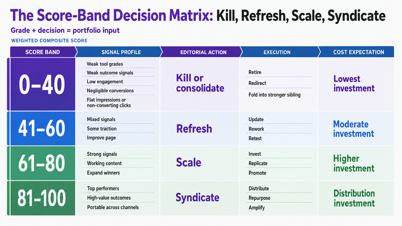 Translate the four score bands and their editorial actions into a scannable decision matrix that mirrors the section's framework
See How High-Scoring SEO Content Directly Impacts Pipeline KPIs
Request a data-backed walkthrough of content scoring benchmarks and discover how leading brands link SEO content performance to measurable ROI across high-stakes marketing channels.
If You Manage Multiple Locations: Portfolio Economics of Scored Content
The math changes when a content manager owns 40, 200, or 800 location pages instead of a single blog. At that scale, scored content stops being an editorial exercise and becomes a portfolio allocation problem. Every location page is a scored asset with its own refresh cost, conversion contribution, and opportunity cost against the next page in the queue. This section is for that operator—the in-house lead running content across a dental group, a law firm footprint, a home services brand, or a senior living portfolio—not the single-site manager.
The core variables are small and stable across verticals. Score band determines the action. Refresh cost per page determines the production floor. Incremental organic sessions and the conversion rate delta determine the return. Layering these against the score-band matrix produces a location-by-location decision that a VP can defend.
| Score band | Action per location page | Cost profile | ROI signal to watch |
|---|---|---|---|
| 0–40 | Consolidate into regional hub or retire | Near-zero (redirect only) | Recovered crawl budget, lifted cluster authority |
| 41–70 | Refresh intro, local proof, conversion block | Fraction of net-new production | Incremental organic sessions, CTR lift 2 |
| 71–85 | Scale template to adjacent locations and services | Full net-new, template-amortized | Conversion rate delta vs. control locations 6 |
| 86–100 | Quarterly refresh, syndicate reviews and schema | Ongoing maintenance | Sustained pipeline contribution 10 |
Two portfolio realities push against pure per-page thinking. First, location pages rarely convert in isolation—service pages, city guides, and provider bios assist the booking, which means influenced conversions belong inside the location-page score, not in a separate report 7. A location page that scores 68 but assists 30% of nearby bookings is not a refresh candidate. It is a scale candidate disguised by a mediocre grade.
Second, refresh cadence has to be set at the cluster level, not the page level. Impressions and ranking distribution by pillar reveal whether a metro cluster is functioning as a coordinated asset or as isolated pages competing with each other 2. When one location dominates the map pack and three sibling pages leak share of voice, the refresh dollar goes to the siblings, not the winner. The portfolio economics of scored content reward operators who allocate against cluster-level outcome signals and starve pages that only look good on the tool-grade layer 9.
Operationalizing the Score: Velocity, AI Assistance, and the Editorial Approval Loop
A revenue-weighted score is only as useful as the production system that acts on it. Editors who spend three days lifting a draft from 68 to 88 on a query the business does not need have used the score against themselves. The operational question is throughput: how many scored assets can move through the workflow each week without collapsing the outcome layer that makes the grade worth trusting in the first place.
Two constraints govern the answer. First, engagement and conversion signals only accumulate at the volume the portfolio can produce, which means score-driven programs need enough scored assets in market to generate reliable outcome data across direct conversions, influenced conversions, and journey coverage 7. A ten-page site cannot learn what a hundred-page site can. Second, refresh cadence competes with net-new production for the same editorial hours, and the 41–70 band—where most ROI leverage sits—only pays out if refresh work actually ships.
This is where AI-assisted drafting changes the math, but only under a specific condition: the score cannot degrade at higher velocity. AI production that inflates word count to hit a 90 grade while dropping conversion contribution reproduces the vanity-ceiling problem at scale 9. Approval-first workflows solve for this by holding the outcome layer as the release gate. Drafts pass a composite grade check, then an editor approves against KPI targets rated on the AMA-style 1–5 scale before publication 1. Nothing ships without both grades clearing.
The practical setup is narrow. AI handles first-draft velocity and refresh cycling. Editors own the scoring rubric, the approval decision, and the outcome-layer weights. Vectoron's content workflow is built around that division of labor for content teams that need to scale scored production without adding headcount.
Frequently Asked Questions
References
- 1.AMA Content Marketing Strategy Scorecard Toolkit.
- 2.Measuring Content Performance - The SEO Handbook.
- 3.431% Monthly ROI for SEO Content.
- 4.7 Key Metrics In Measuring Content Effectiveness.
- 5.Using Quality Score to Guide Optimizations.
- 6.Content Performance Metrics - Measuring Success.
- 7.Seven Key Metrics to Measure the Effectiveness of Your Content in 2024.
- 8.19 Actionable Content Marketing Metrics for Conversion.
- 9.Measuring What Matters: A Guide to Digital Content Effectiveness Metrics.
- 10.Content Marketing Measurement: Metrics That Matter.