
Key Takeaways
- AgencyAnalytics solves cadence and automation cheaply for mid-sized agencies running standardized retainers, but its rank-heavy defaults weaken clarity and rarely carry premium renewals alone.
- Looker Studio offers free flexibility and strong outcome linkage through BigQuery and CRM pulls, but its high build and maintenance cost overwhelms generalist account teams.
- Databox organizes dashboards around KPIs rather than widgets, lifting clarity and outcome linkage for agencies whose clients ask about revenue before rankings 5.
- SE Ranking bundles rank tracking and white-label reporting affordably for solo consultants and sub-ten-account agencies, but its SERP-centered reports lack outcome linkage and decision support.
- Semrush Agency Growth Kit delivers unmatched diagnostic depth, yet default templates risk cognitive overload and require ruthless editing before reaching non-technical stakeholders 8, 19.
- Whatagraph fits agencies running mixed SEO, paid, and social retainers, letting organic performance defend itself inside a cross-channel narrative during renewal conversations.
- Vectoron treats reporting as an output of an approval-first AI execution loop, ending reviews with documented next actions tied to qualified calls, bookings, and pipeline.
Reporting Is the Renewal Conversation
Most SEO retainers are not lost in the audit. They are lost in the report. When a client opens a monthly PDF and sees keyword counts, impressions, and a screenshot of a rankings widget, the renewal question has already been answered — quietly, and usually against the agency. Reporting is where the retainer either earns its next quarter or begins its slow drift toward cancellation.
Industry practitioner data pegs annual churn for SEO agencies at roughly 38%, with poor reporting cited as the leading cause; agencies that set explicit KPIs and a predictable reporting cadence at onboarding see 15–20 percentage points of retention lift over that baseline 16. That gap is the entire premise of this shortlist. The seven platforms below are not ranked on connector counts or template libraries. They are judged on whether the software makes it easier to run a client review that ends in a next action, a documented decision, and a reason to keep paying.
What Poor SEO Reporting Actually Costs an Agency Book
The math on reporting quality is unforgiving. Practitioner data places average annual SEO agency churn at 38%, with poor reporting named as the leading cause; agencies that set explicit KPIs and a predictable reporting schedule at onboarding land 15–20 percentage points above that baseline, translating to roughly 18–23% annual churn instead 16. That single behavioral variable — reporting cadence and clarity — separates a book that rebuilds itself every three years from one that compounds.
Applied to a live book of business, the delta reads as revenue, not sentiment. The table below models annual recurring revenue at risk using only the two sourced churn rates and operator-supplied variables. It is not a forecast; it is a stake in the ground.
| Monthly retainer | Active accounts | Baseline ARR | Lost ARR at 38% churn 16 | Lost ARR at 20% churn 16 | Retained ARR delta |
|---|---|---|---|---|---|
| $2,500 | 20 | $600,000 | $228,000 | $120,000 | $108,000 |
| $4,000 | 25 | $1,200,000 | $456,000 | $240,000 | $216,000 |
| $6,500 | 40 | $3,120,000 | $1,185,600 | $624,000 | $561,600 |
The retained ARR delta is what an agency owner is actually buying when evaluating SEO report software. A tool that shaves cost per account by $80/month but leaves reporting cadence unresolved is subsidizing the churn line item. A tool that costs more but institutionalizes cadence, executive summaries, and outcome-linked KPIs is defending the middle column of that table. Every scorecard criterion in the sections that follow ladders back to this delta.
The Retention Scorecard: Five Criteria That Actually Move Churn
Feature matrices are how vendors want to be evaluated. Retention math is how they should be evaluated. Before naming a single tool, it helps to fix the lens: five criteria that map directly to the behaviors research links to renewal, not to procurement checklists. Each criterion below carries a specific mechanism of churn reduction and a specific piece of evidence behind it. Every tool in the shortlist that follows is scored against these five, not against connector counts or template libraries.
The scorecard is deliberately narrow. Interactive dashboard research shows that streamlined designs improve decision-making, while overbuilt ones cause cognitive overload and reduce decision efficiency 8. An effective decision-support dashboard is defined by clearly communicated end-user requirements and a design that is simple and straight to the point 19. Adding a sixth or seventh criterion — mobile app polish, template gallery depth, brand-color flexibility — pulls attention away from the variables that actually predict renewal. Those variables are whether the client understands what they are looking at, sees it on a predictable schedule, can tie it to revenue-adjacent outcomes, walks out with a decision, and does not cost the agency margin to produce.
Clarity, Cadence, Outcome Linkage, Decision Support, Automation Load
Clarity : Measures whether a non-SEO stakeholder — a managing partner, a practice administrator, a franchise operations lead — can read the dashboard without a translator. Retention improves with reporting clarity, not reporting volume 14. A tool that surfaces one trend line and a plain-language summary outperforms one that surfaces twelve widgets the client silently ignores.
Cadence : Measures whether the software makes a predictable review rhythm cheap to sustain. Agencies that set explicit KPIs and reporting schedules at onboarding land 15–20 points above the 38% SEO-agency churn baseline 16. Cadence fails when producing the next report requires two analyst-hours the agency will not spend.
Outcome Linkage : Measures whether organic performance is expressed in the units the client's business already runs on: qualified calls, booked consultations, pipeline, revenue-adjacent conversions. Marketing performance is defined as effectiveness and efficiency against market-related goals like revenue and growth, not isolated metric snapshots 17.
Decision Support : Measures whether the tool ends each review with a documented next action, not a data dump. Diagnostic-only measurement systems can actually hinder strategic capability 18; the platform has to nudge toward a decision, not just monitor.
Automation Load : Measures agency-side cost per account per report cycle. This is the margin criterion. A tool that lifts retention but consumes the delivery team's week is not a retention instrument — it is a tax.
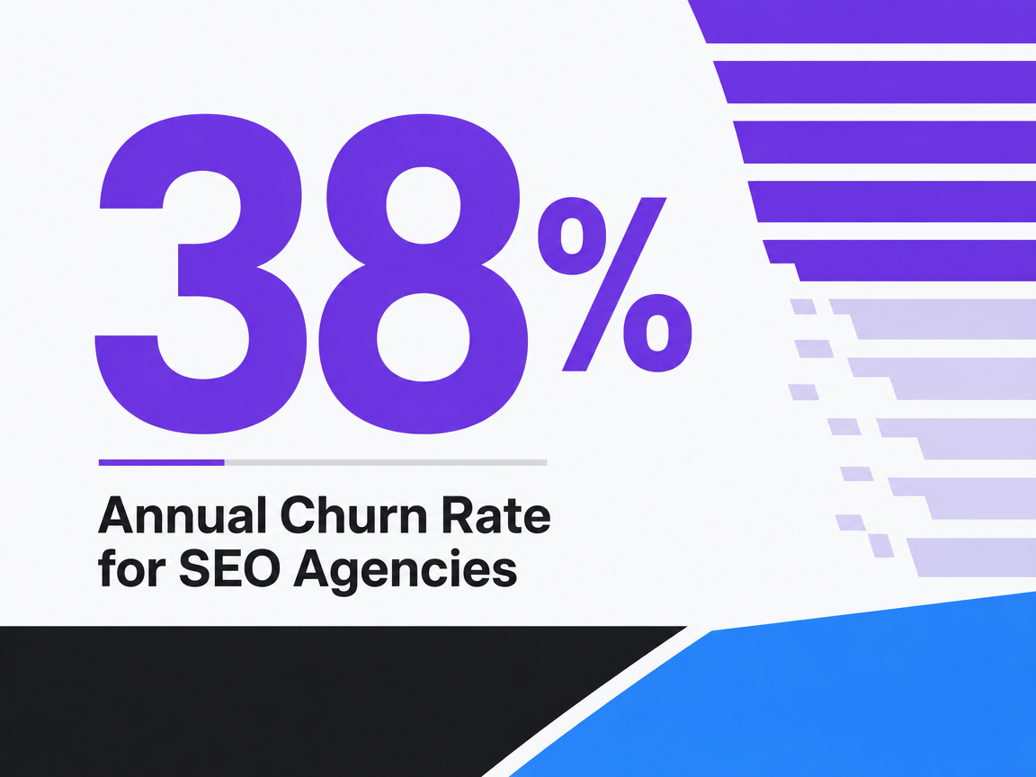 Annual Churn Rate for SEO Agencies
Annual Churn Rate for SEO Agencies
Test Automated SEO Reporting On Live Accounts
Deliver actual SEO reports to clients during your trial and evaluate efficiency gains in real scenarios.
Why Live Dashboards Beat Emailed PDFs
The monthly PDF is the format most SEO retainers still ship on, and it is the format most quietly working against renewal. A PDF is a snapshot dated the moment it was rendered. By the time the client opens it — usually days after the analyst finished it — the numbers have already drifted, the questions the client wants to ask cannot be answered inside the document, and the review meeting turns into a translation session instead of a decision session.
The behavioral gap between static reports and live dashboards is measurable. In a study of real-time analytics dashboards across organizations, frequent dashboard users reported a mean decision-speed score of 4.17 versus 2.25 for infrequent users (p < 0.001), with confidence in data accuracy (r = 0.68) emerging as a stronger predictor of positive outcomes than adoption or usage frequency 2. The sample studied enterprise operators, not SEO clients specifically, but the mechanism transfers cleanly: a stakeholder who can query a live view mid-conversation makes decisions faster than one waiting for the next attachment.
Decision-making speed by dashboard usage frequency (mean score, higher = faster) 2
| User group | Mean decision-speed score |
|---|---|
| Frequent dashboard users | 4.17 |
| Infrequent dashboard users | 2.25 |
For an agency, the practical consequence is cadence economics. A live dashboard the client can open unprompted turns every unplanned login into a micro-review, so the monthly meeting becomes a decision checkpoint rather than a data reveal. A PDF workflow, by contrast, concentrates all client attention into one meeting per month — and if that meeting goes sideways, there is no ambient touchpoint to recover it before renewal.
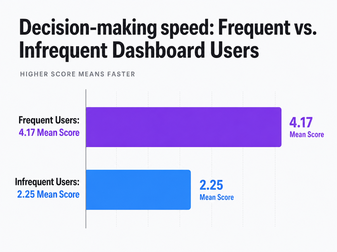 Decision-making speed: Frequent vs. Infrequent Dashboard Users
Comparison of mean scores for self-reported decision-making speed on a scale, where higher is faster. Frequent dashboard users had a mean of 4.17 versus 2.25 for infrequent users.
The Seven Tools, Scored Against the Retention Lens
Each tool below is evaluated against the five scorecard criteria — Clarity, Cadence, Outcome Linkage, Decision Support, and Automation Load — with a one-paragraph verdict on the agency profile it actually fits. Feature depth is noted where it changes the retention calculus, not catalogued for its own sake.
AgencyAnalytics: The Default White-Label Workhorse
AgencyAnalytics is the platform most SEO agencies default to because it solves the cadence problem cheaply. Scheduled white-label PDFs, drag-and-drop widgets, and a client portal cover the mechanical parts of monthly reporting without requiring analyst hours per account. On the scorecard, it scores highest on Cadence and Automation Load, where the retention math is most sensitive to production friction.
Clarity is uneven. Default templates lean heavily on rank tracking, GSC impressions, and backlink counts — the exact metrics that turn a review into a translation session for a managing partner or practice administrator. Outcome Linkage depends entirely on how the agency configures GA4 conversion events and CRM pulls; the software will surface qualified calls and booked consultations if the connectors are wired, but it will not push the agency toward doing so. Decision Support is the weakest column: annotations exist, but the platform does not force a next-action field, and reviews can end without a documented commitment.
The honest verdict: this fits the 10–25 account agency running standardized SEO retainers where the delivery team cannot afford custom dashboards per client. It defends renewal at mid-tier retainers when the account manager treats the template as a starting point, not a finished report. It will not carry a renewal on its own for a $6,500/month retainer where the client expects revenue-tied narrative.
Looker Studio with SEO Connectors: Free, Flexible, High Build Cost
Looker Studio (formerly Data Studio) sits at the opposite end of the spectrum. The tool is free, the GA4 and GSC connectors are native, and third-party connectors from Supermetrics or Windsor.ai extend it into rank tracking and paid media. Clarity, on a well-built dashboard, is excellent — a single trend line and a plain-language callout are trivial to construct.
The scorecard cost shows up in Automation Load. Every client requires a template build, connector configuration, and refresh troubleshooting. Data source outages are common and land on the account manager's desk. Cadence is technically strong — dashboards are live and always-on — but only if someone maintains them. Decision Support is entirely manual: the tool has no notion of a next-action field, and executive summaries have to be pasted into scorecard widgets or emailed separately.
Outcome Linkage is where Looker Studio can genuinely differentiate. Because it pulls from BigQuery, CRM exports, and call-tracking APIs, an agency willing to invest the build hours can surface qualified calls, pipeline dollars, and booked consultations alongside organic sessions — the units marketing performance research says actually predict firm outcomes 17.
The honest verdict: this fits the solo SEO consultant with technical fluency and the agency operations lead building a single golden template to clone across a homogeneous book. It will drown a generalist account team.
Databox: KPI-First Dashboards for Outcome-Linked Reviews
Databox inverts the usual reporting architecture. Instead of building a page of widgets and hoping the client finds the number that matters, the platform starts with a KPI — organic sessions, qualified calls, revenue from organic — and organizes the rest of the dashboard around goal tracking, alerts, and trend context. On the scorecard, that structure lifts Clarity and Outcome Linkage well above the AgencyAnalytics default.
The interactive design does measurable work. Survey research on interactive dashboards found that 78% of users rated them easy to use, 85% reported faster decision-making, and 75% reported a beneficial effect on overall business performance 5. The sample studied general business users rather than SEO clients specifically, but the pattern — ease-of-use compounding into decision speed compounding into perceived business impact — is exactly the sequence a renewal conversation depends on.
User-reported impact of interactive dashboards 5
| Measure | Share of users |
|---|---|
| Rated dashboard easy to use | 78% |
| Reported faster decision-making | 85% |
| Reported beneficial business effect | 75% |
Automation Load is moderate — templates and data source connections are less brittle than Looker Studio but require more setup than AgencyAnalytics. The honest verdict: this fits the 15–40 account agency whose retainer averages above $4,000/month and whose clients ask 'what did this do to revenue' before 'where did we rank.'
SE Ranking: Rank Tracking and Reporting for Solo and Small Agencies
SE Ranking bundles rank tracking, site audit, backlink monitoring, and white-label reporting at a price point that makes it viable for solo operators and agencies under ten accounts. On the scorecard, Automation Load is its strongest column — the platform generates scheduled reports without a separate reporting tool sitting on top of the SEO stack.
Clarity is acceptable for SEO-literate stakeholders but weak for business owners who do not think in SERP positions. The reporting module is competent rather than opinionated: it will render the widgets configured, and it will not push the agency toward a plain-language executive summary. Outcome Linkage is thin. GA4 integration exists, but the platform's center of gravity is SERP data, and reports drift toward rank movements rather than qualified-call or pipeline outcomes.
Decision Support is minimal. The tool documents what happened; the next action has to be authored by the account manager in a separate note or email. Cadence is dependable — scheduled delivery works — but the review meeting still lives outside the platform.
The honest verdict: this fits the solo consultant and the sub-ten-account agency serving small local service businesses where the client's baseline expectation is a rank report and an email summary, and where a $2,000/month retainer cannot absorb the seat cost of a dedicated reporting platform on top of an SEO toolset.
Semrush Agency Growth Kit: Diagnostic Depth, Cognitive Load Risk
Semrush's Agency Growth Kit layers client management, lead-gen features, and a white-label reporting module on top of the full Semrush toolkit. Diagnostic depth is unmatched in this list — competitor gap analysis, keyword cannibalization detection, backlink toxicity, and technical crawl data all pull from the same source. On the scorecard, that depth is a double-edged score.
Automation Load is favorable inside the Semrush ecosystem, since reports pull from data the agency is already using for delivery. Cadence is straightforward. The risk sits in Clarity and Decision Support. Dashboard research is direct on this point: excessively complex dashboards cause cognitive overload and reduce decision efficiency, while streamlined designs enhance decision-making speed and accuracy 8. An effective decision-support dashboard is defined by clearly communicated end-user requirements and a design that is simple and straight to the point 19. Semrush reports, left at their default configuration, easily cross that threshold and land in the client inbox as a data dump.
Outcome Linkage requires the agency to strip out competitive-intelligence widgets that are useful for the analyst but noise for the client, and replace them with GA4 conversion data and business-outcome framing.
The honest verdict: this fits the 20–50 account agency with a dedicated reporting lead who edits templates ruthlessly, and whose clients include marketing directors who can absorb diagnostic depth. It punishes agencies that ship the default template to a managing partner.
Whatagraph: Cross-Channel Reporting for Mixed Retainers
Whatagraph is built for agencies whose retainers span SEO, paid media, and social rather than SEO alone. Its native connector library covers GA4, GSC, Google Ads, Meta, LinkedIn, TikTok, and the major call-tracking platforms, and its templates are designed to render cross-channel narratives without requiring a data warehouse behind them. On the scorecard, Clarity and Outcome Linkage benefit from that architecture — the client sees organic performance in the context of the other channels driving the same business outcome.
Cadence is strong: scheduled delivery, live client dashboards, and template cloning across accounts are all first-class. Automation Load is moderate, higher than AgencyAnalytics on initial setup but lower than Looker Studio on ongoing maintenance. Decision Support is present but shallow — annotations and goal tracking exist, but the platform does not enforce a next-action field.
The scorecard cost is category fit. For a pure-SEO retainer, Whatagraph's cross-channel strengths are unused capacity the agency is paying for. Its value emerges when the client's other channels are visible in the same report, giving the account manager standing to defend organic's contribution against paid media's shorter feedback loop.
The honest verdict: this fits the 15–40 account agency running mixed retainers where SEO is one line item among three or four, and where the renewal conversation is really about total marketing performance.
Vectoron: Approval-First AI Execution With Reporting as an Output
Vectoron does not compete with the six platforms above on reporting features. It sits in a different category — an AI marketing execution platform where specialist strategists for content, SEO, PPC, backlinks, social, and call intelligence read live business signals, rank priorities, and route recommendations through a Command Center for human approval before anything ships. Reporting is one output of that loop, not the product's center of gravity.
On the retention scorecard, the implications are specific. Decision Support is the strongest column: because every recommendation is scored, sequenced, and paired with the reasoning behind it, the client review naturally ends in an approved next action rather than a data reveal. Automation Load is the second strongest, since ranked priorities and executed work reduce the analyst hours per account that normally consume delivery margin. Outcome Linkage is native — the platform's signals are qualified calls, bookings, cost per lead, and pipeline, not impressions.
Clarity depends on how the agency configures the client-facing view; the underlying data is dense. Cadence shifts from monthly PDF to continuous approval flow, which suits some clients and unsettles others.
The honest verdict: this fits agencies serving high-stakes verticals — law, behavioral health, dental/DSO, home services, senior living — where a renewal hinges on a documented decision loop tied to revenue-adjacent KPIs, not on a prettier rank report.
If You Manage Multi-Location or DSO-Style Books
The scorecard shifts when the client is not a single business but a portfolio operator — a DSO with 60 practices, a home-services franchisor with 40 territories, a senior living group with a dozen communities, or a multi-state law firm with regional offices. The renewal conversation stops being with a founder and starts being with a director of marketing who reports to a CFO. Reporting has to survive that translation.
Three scorecard columns dominate at this scale. Clarity has to work at two altitudes simultaneously: an aggregated portfolio view for the executive stakeholder and a location-level drill-down for the operator running each site. Dashboard research is unambiguous that streamlined, role-tailored views outperform one-size-fits-all layouts, and that overbuilt reports collapse decision efficiency 8. Outcome Linkage has to normalize across locations — qualified calls per location, cost per booked appointment, branded versus non-branded organic sessions by market — so a weak location cannot hide behind a strong one, and a strong location is not penalized for market size. Automation Load is the margin variable that decides whether the account is profitable at all; producing 40 bespoke reports monthly is a delivery-model failure, not a reporting problem.
Whatagraph and Databox handle portfolio rollups natively. Looker Studio handles them at the cost of a data warehouse behind it. Approval-first execution platforms shift the question from 'how do we report on 40 locations' to 'which three locations need an approved intervention this week' — a different retention loop entirely.
See How Leading Agencies Streamline SEO Reporting and Retain High-Value Clients
Connect with our team to assess your current SEO reporting workflow and discover data-backed solutions used by top agencies to reduce reporting overhead while improving client satisfaction.
Turning a Tool Into a Renewal Ritual
The software choice matters less than the ritual it enables. A dashboard the client never opens is worse than an emailed PDF the client actually reads, because the tool cost is still on the books. The agencies that convert reporting into retention embed the dashboard into a recurring rhythm: weekly account check-ins on active experiments, monthly reviews tied to a documented next action, and quarterly business reviews where organic performance is reframed against pipeline and revenue 9. Without those rituals, dashboards drift into wallpaper.
The mechanics are small and repeatable. Every review opens with a three-line executive summary — one win, one challenge, one next action — before any chart loads. Transparent reporting that names both wins and challenges alongside clear next steps is what practitioners cite as the actual retention lever, not metric density 10, 13. The chart pull that follows exists to defend or revise that summary, not to fill time.
The next action is the artifact that closes the loop. It gets logged inside the reporting tool as an annotation, assigned an owner, and reappears at the top of the following review. That single field converts the dashboard from a monitoring surface into a decision system — the distinction marketing performance measurement research draws between diagnostic reporting and strategic use 18. The tool is the instrument; the ritual is the retention product.
Attribution Honesty: What to Disclose Inside the Report
The report that closes a renewal is the one that names what it cannot measure. Attribution is the process of assigning value to user actions across screens and touchpoints that contribute to a desired outcome 21 — and every SEO report ships with gaps in that chain: consent-mode sampling, iOS traffic dropped into direct, and event-level versus summary reports in Google's privacy-preserving Attribution Reporting API 22. A dashboard that presents organic-attributed conversions without acknowledging those gaps invites the client to discover them elsewhere, usually mid-renewal.
The disclosure that works is short and structural. One line naming the attribution model in use, one line naming what is excluded (offline conversions not tied back, cross-device sessions lost to consent), and one line naming the compensating signal — call-tracking pulls, CRM-stamped organic leads, branded versus non-branded session splits. Transparency about data practices is what sustains trust in client relationships over time 24; the reporting tool is where that transparency either lives or gets skipped.
 Operational Efficiency Gains from Power BI Dashboards
Operational Efficiency Gains from Power BI Dashboards
Frequently Asked Questions
References
- 1.Machine Learning-Enabled Business Intelligence Dashboards and Strategic Decision-Making Performance.
- 2.The Impact of Real-Time Analytics Dashboards on Decision Quality and Organizational Performance.
- 3.Transforming Organizational Decision-Making Using Power BI: A Case Study Approach.
- 4.Transforming Organizational Decision-Making Using Power BI (Full Text & Findings).
- 5.Interactive Dashboards and Their Impact on Business Analytics and Performance.
- 6.The Impact of Business Intelligence System (BIS) on Quality of Strategic Decision-Making.
- 7.Real-Time Analytics Dashboards for Decision-Making Using Tableau.
- 8.How Interactive Dashboards Improve Decision-Making and Cognitive Efficiency.
- 9.Using Data Analytics to Retain Customers and Protect Revenue.
- 10.Transparent Reporting: The Secret to Client Retention.
- 11.How Business Intelligence Dashboards Improve Data-Driven Decision-Making.
- 12.Business Intelligence Dashboards: Driving Strategic Decision-Making for Modern Enterprises.
- 13.Client Retention Dashboards: How Transparent Reporting Reduces Churn and Increases Lifetime Value.
- 14.Building Client Reporting Dashboards That Improve Retention.
- 15.How to Create a Marketing Dashboard That Helps You Keep Clients and Win New Ones.
- 16.19 SEO Client Reporting Best Practices That Retain Clients.
- 17.Measuring Marketing Performance: A Review and A Framework.
- 18.Marketing Performance Measurement Systems and Firm Performance.
- 19.Decision Support Dashboards: Their impact on the ICT ....
- 20.The State of Response Rates Benchmark Report.
- 21.Digital Attribution Primer 2.0.
- 22.Attribution Reporting API - Google.
- 23.2025 Edelman Trust Barometer Global Report.
- 24.Customer Data: Designing for Transparency and Trust.